End-to-end design of a circular economy SaaS, unifying three different services into one coherent product now used by 20K+ companies.
Client
Circularity
Industry
Circular economy
Year
2023
Methodology
Agile
Role
Lead product designer
Team
Project manager Design director Lead product designer Full-stack developers Back-end developers Front-end developers
End-to-end design of a circular economy SaaS, unifying three different services into one coherent product now used by 20K+ companies.
Client
Circularity
Industry
Circular economy
Year
2023
Methodology
Agile
Role
Lead product designer
Team
Project manager Design director Lead product designer Full-stack developers Back-end developers Front-end developers
Led the end-to-end design of a circular economy SaaS, unifying three different services into one coherent product now used by 20K+ companies.
Client
Circularity
Industry
Circular economy
Year
2023
Methodology
Agile
Role
Lead product designer
Team
Project manager Design director Lead product designer Full-stack developers Back-end developers Front-end developers

Two kinds of complexity: a tangled system and dense data entry
CHALLENGE
Two kinds of complexity: a tangled system and dense data entry
Circularity needed three separate services to work as one. Each had its own logic, its own users and role-based access shaping what people could see and do. The services also relied on dense, highly technical data that users had to enter correctly for the tools to work. The case came down to two problems: making very different services feel like one coherent system, and making heavy data entry manageable.
5
user roles
3
digital services
1
ecosystem
Two kinds of complexity: a tangled system and dense data entry
CHALLENGE
Two kinds of complexity: a tangled system and dense data entry
Circularity needed three separate services to work as one. Each had its own logic, its own users and role-based access shaping what people could see and do. The services also relied on dense, highly technical data that users had to enter correctly for the tools to work. The case came down to two problems: making very different services feel like one coherent system, and making heavy data entry manageable.
5
user roles
3
digital services
1
ecosystem
CHALLENGE
Two kinds of complexity: a tangled system and dense data entry
Circularity needed three separate services to work as one. Each had its own logic, its own users and role-based access shaping what people could see and do. The services also relied on dense, highly technical data that users had to enter correctly for the tools to work. The case came down to two problems: making very different services feel like one coherent system, and making heavy data entry manageable.
5
user roles
3
digital services
1
ecosystem

A complex industrial system people could actually run their operations on
SOLUTION AND IMPACT
A complex industrial system people could actually run their operations on
A system that could handle complex industrial data while staying usable enough for companies to run their operations on it. A shared architecture ties the services together, so a user moving between them never has to relearn how the product works. Data entry stays fast and approachable, even for the most technical inputs. Today it is used by 20,000+ companies across Europe, tracking over 1 million material flows and 2,000+ impact metrics.
20K
registered companies
1M
material flows tracked
2K
impact metrics measured
A complex industrial system people could actually run their operations on
SOLUTION AND IMPACT
A complex industrial system people could actually run their operations on
A system that could handle complex industrial data while staying usable enough for companies to run their operations on it. A shared architecture ties the services together, so a user moving between them never has to relearn how the product works. Data entry stays fast and approachable, even for the most technical inputs. Today it is used by 20,000+ companies across Europe, tracking over 1 million material flows and 2,000+ impact metrics.
20K
registered companies
1M
material flows tracked
2K
impact metrics measured
SOLUTION AND IMPACT
A complex industrial system people could actually run their operations on
A system that could handle complex industrial data while staying usable enough for companies to run their operations on it. A shared architecture ties the services together, so a user moving between them never has to relearn how the product works. Data entry stays fast and approachable, even for the most technical inputs. Today it is used by 20,000+ companies across Europe, tracking over 1 million material flows and 2,000+ impact metrics.
20K
registered companies
1M
material flows tracked
2K
impact metrics measured

DESIGN DECISION: ARCHITECTURE
How do you turn a tangle of services, users and roles into one navigable product?
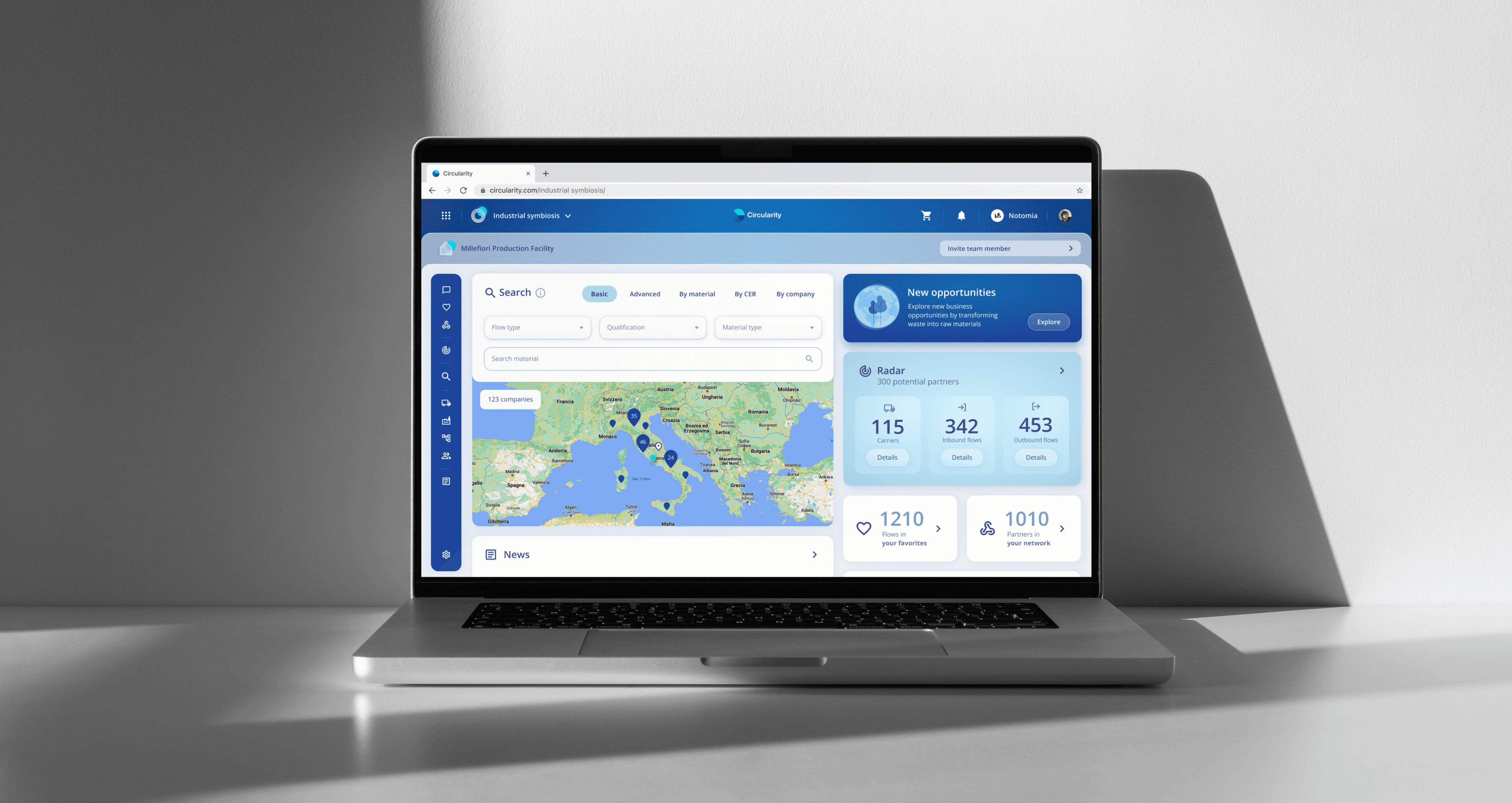
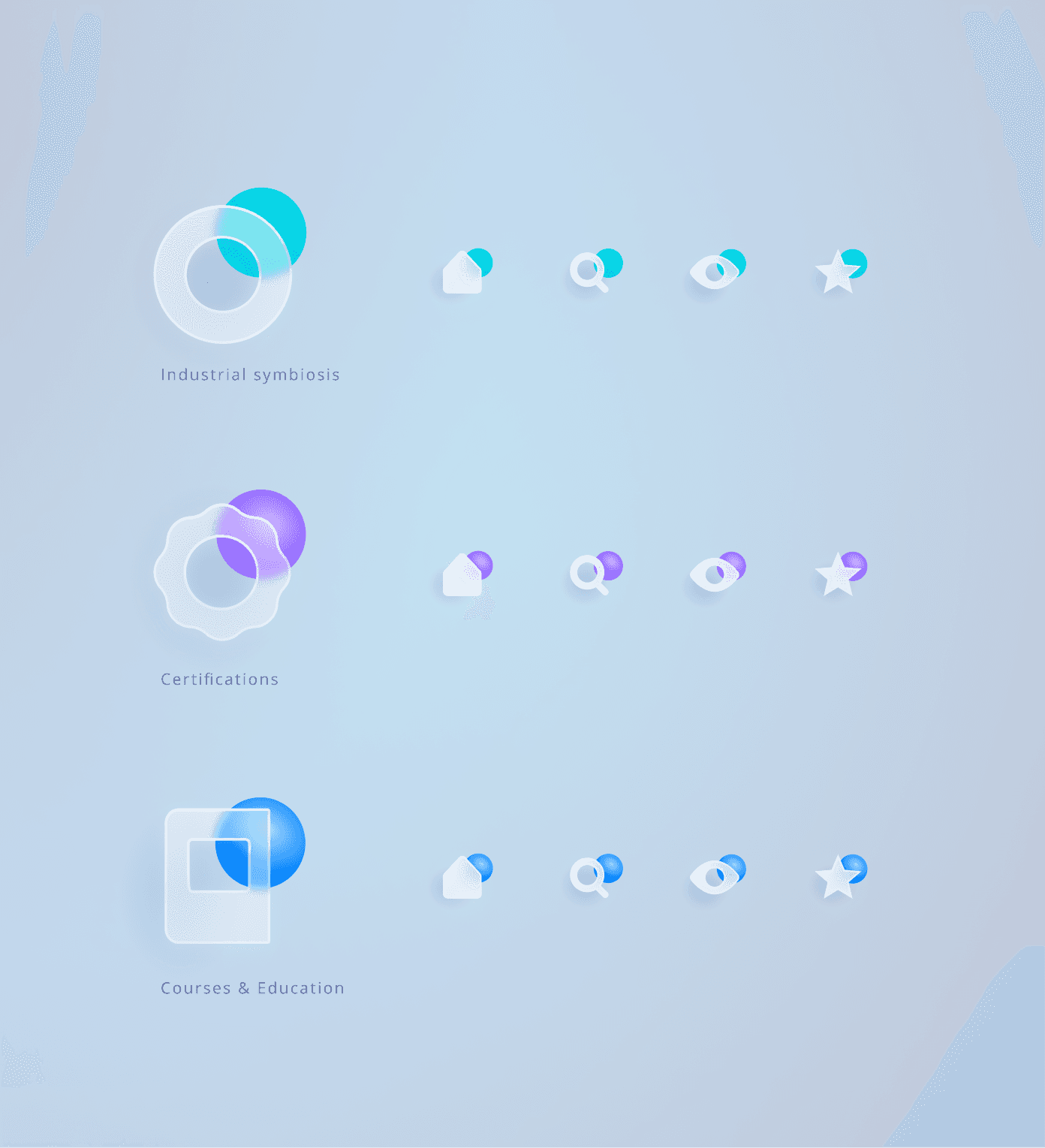
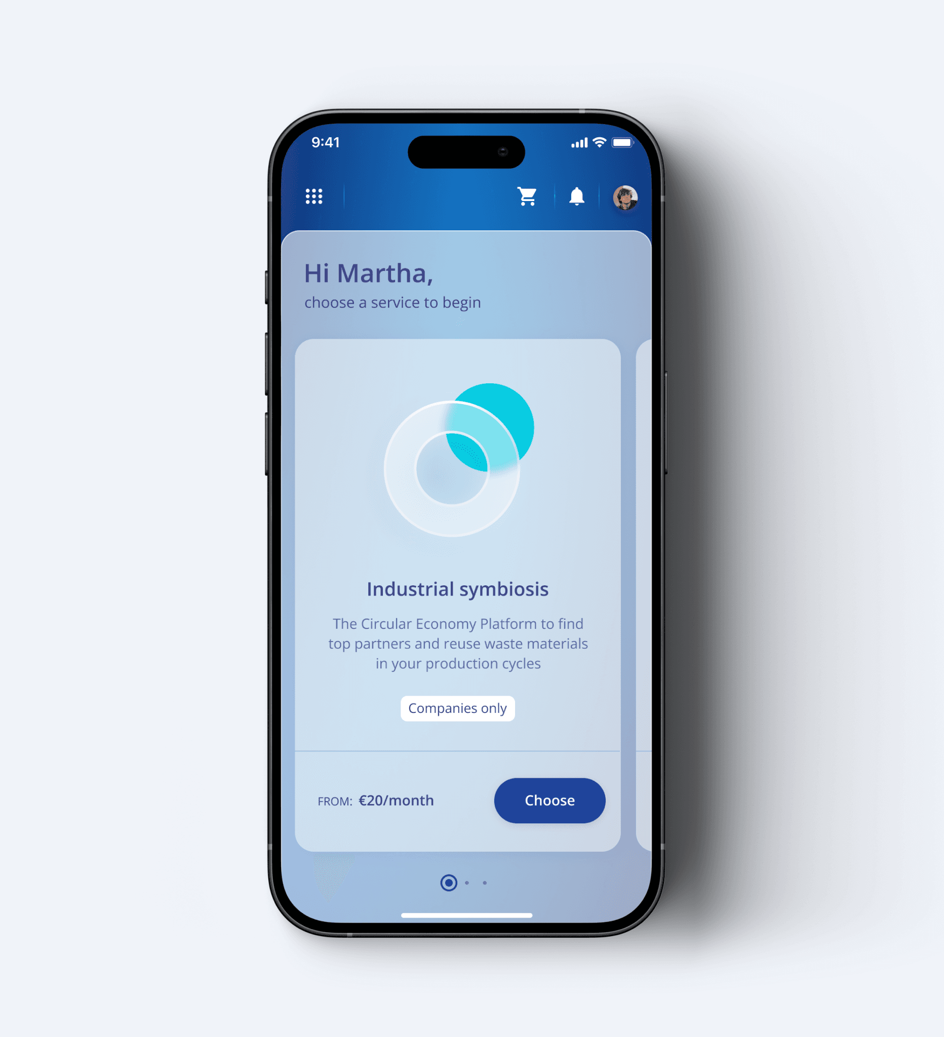
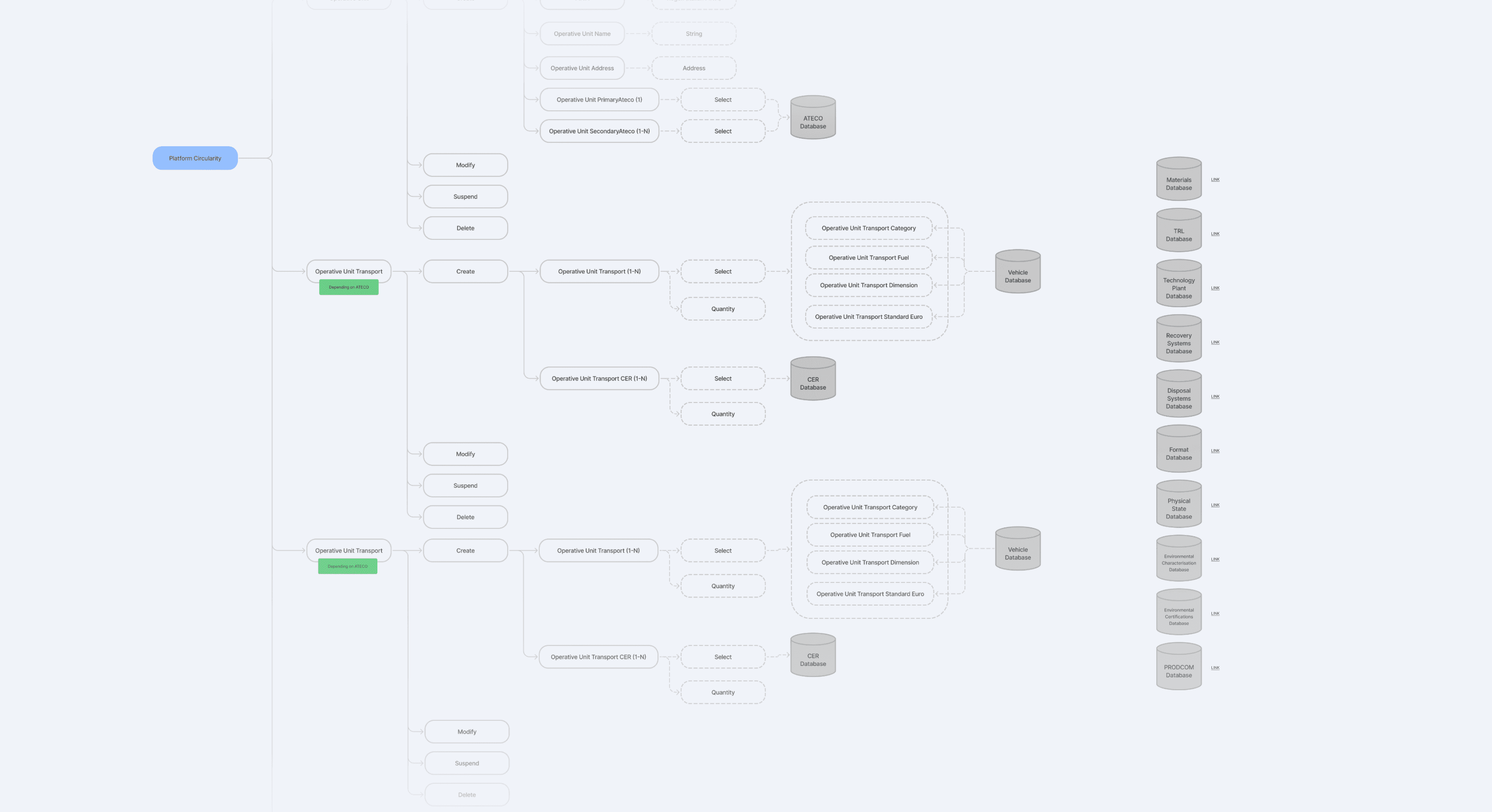
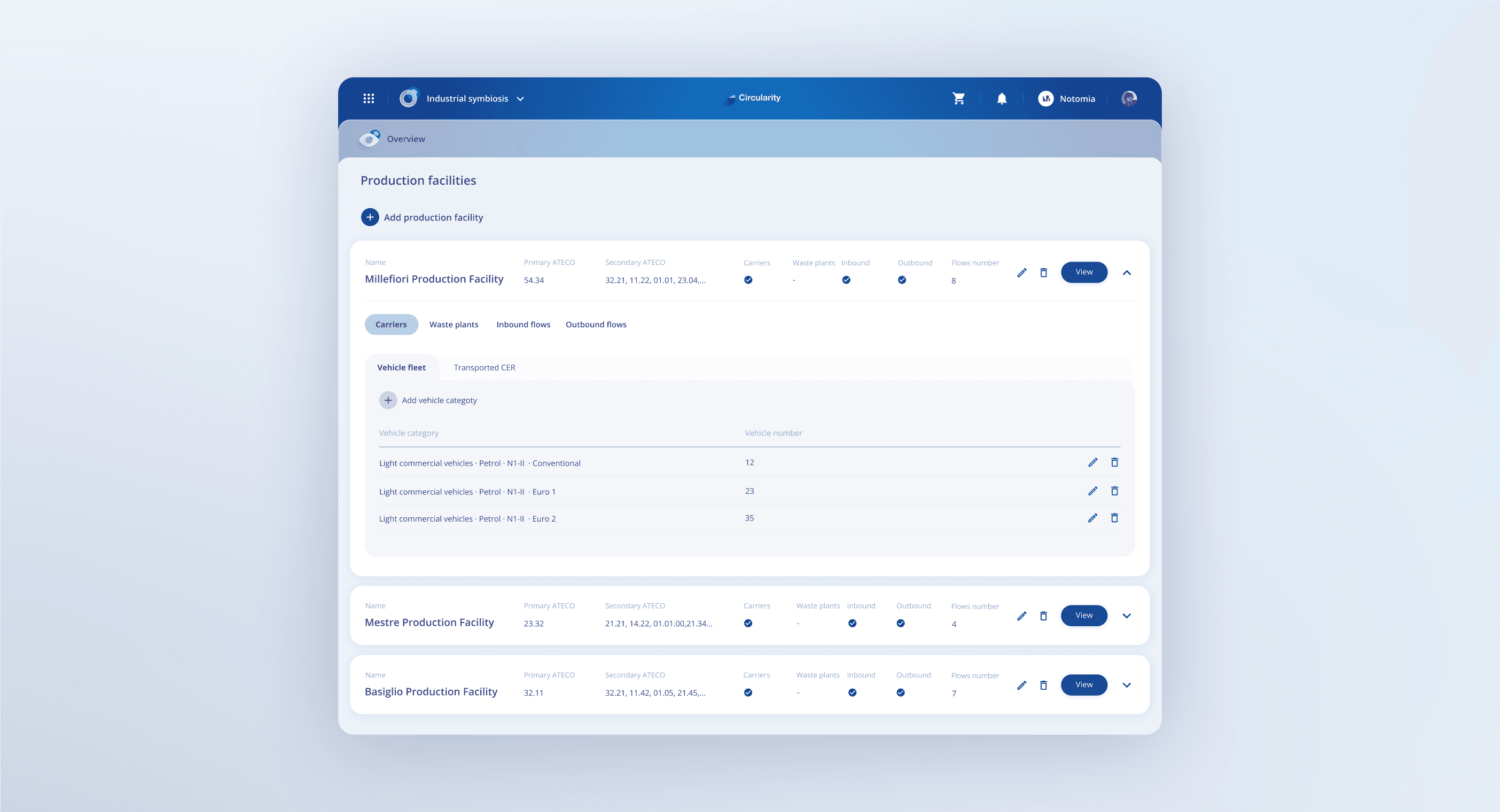
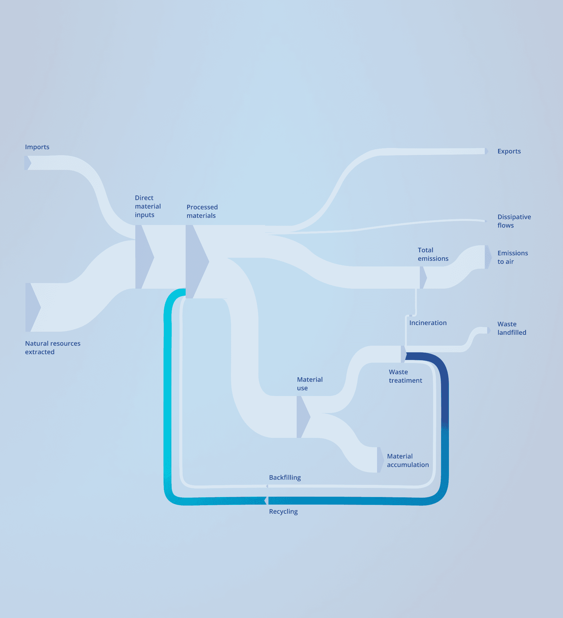
The system had to feel like one product even though it pulled in several directions at once: different services, different user types, multiple production entities inside each company, and role-based access shaping what people could see. The structure that finally worked separated this into three layers: the service, the organization, and the production entities inside it. Those layers became the navigation, so the product was organized by the same logic no matter which service you were in or how much of it you used.
DESIGN DECISION: ARCHITECTURE
How do you turn a tangle of services, users and roles into one navigable product?
The system had to feel like one product even though it pulled in several directions at once: different services, different user types, multiple production entities inside each company, and role-based access shaping what people could see. The structure that finally worked separated this into three layers: the service, the organization, and the production entities inside it. Those layers became the navigation, so the product was organized by the same logic no matter which service you were in or how much of it you used.
DESIGN DECISION: ARCHITECTURE
How do you turn a tangle of services, users and roles into one navigable product?
The system had to feel like one product even though it pulled in several directions at once: different services, different user types, multiple production entities inside each company, and role-based access shaping what people could see. The structure that finally worked separated this into three layers: the service, the organization, and the production entities inside it. Those layers became the navigation, so the product was organized by the same logic no matter which service you were in or how much of it you used.
DESIGN DECISION: DATA ENTRY
How do you make complex classification fast for experts and possible for everyone?
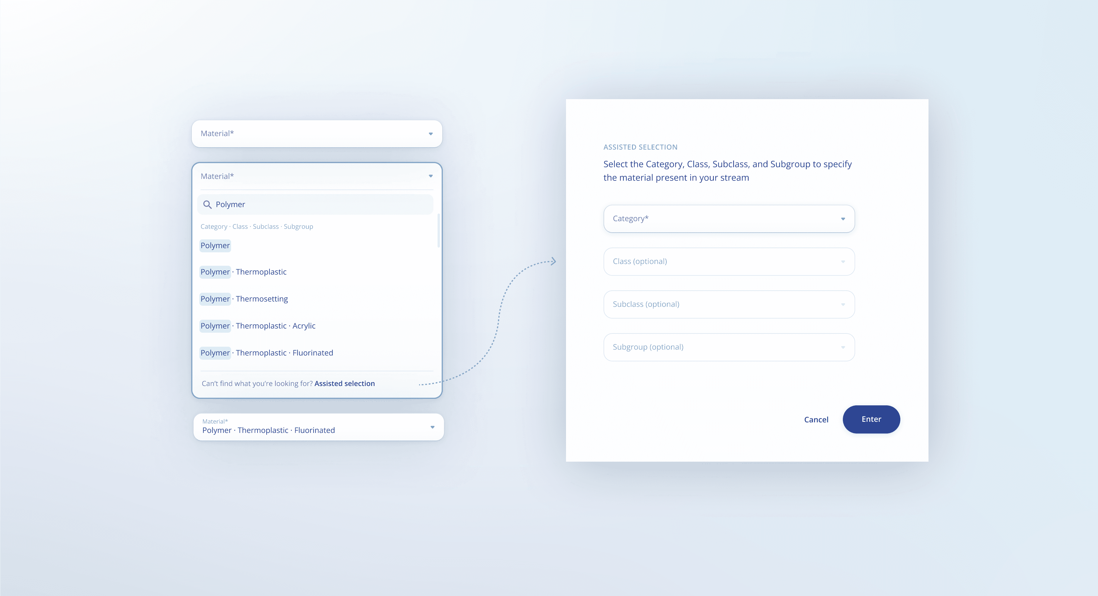
Several services depended on dense, technical input, so every data-entry component and flow was designed around one goal: getting accurate information in with the least effort. The hardest case was material classification, which ran across four levels where precision mattered and dropping detail wasn't an option. User research showed two kinds of people entering data: those who knew what they needed and wanted speed, and those who weren't sure and needed guidance. So the selector worked in two modes, a fast search for the first group and an assisted path through the four levels for the second, one component serving both without slowing the expert or stranding the unsure user.
DESIGN DECISION: DATA ENTRY
How do you make complex classification fast for experts and possible for everyone?
Several services depended on dense, technical input, so every data-entry component and flow was designed around one goal: getting accurate information in with the least effort. The hardest case was material classification, which ran across four levels where precision mattered and dropping detail wasn't an option. User research showed two kinds of people entering data: those who knew what they needed and wanted speed, and those who weren't sure and needed guidance. So the selector worked in two modes, a fast search for the first group and an assisted path through the four levels for the second, one component serving both without slowing the expert or stranding the unsure user.
DESIGN DECISION: DATA ENTRY
How do you make complex classification fast for experts and possible for everyone?
Several services depended on dense, technical input, so every data-entry component and flow was designed around one goal: getting accurate information in with the least effort. The hardest case was material classification, which ran across four levels where precision mattered and dropping detail wasn't an option. User research showed two kinds of people entering data: those who knew what they needed and wanted speed, and those who weren't sure and needed guidance. So the selector worked in two modes, a fast search for the first group and an assisted path through the four levels for the second, one component serving both without slowing the expert or stranding the unsure user.
DESIGN DECISION: MATCHING TOOL
How do you help users find the right match without knowing where to look?
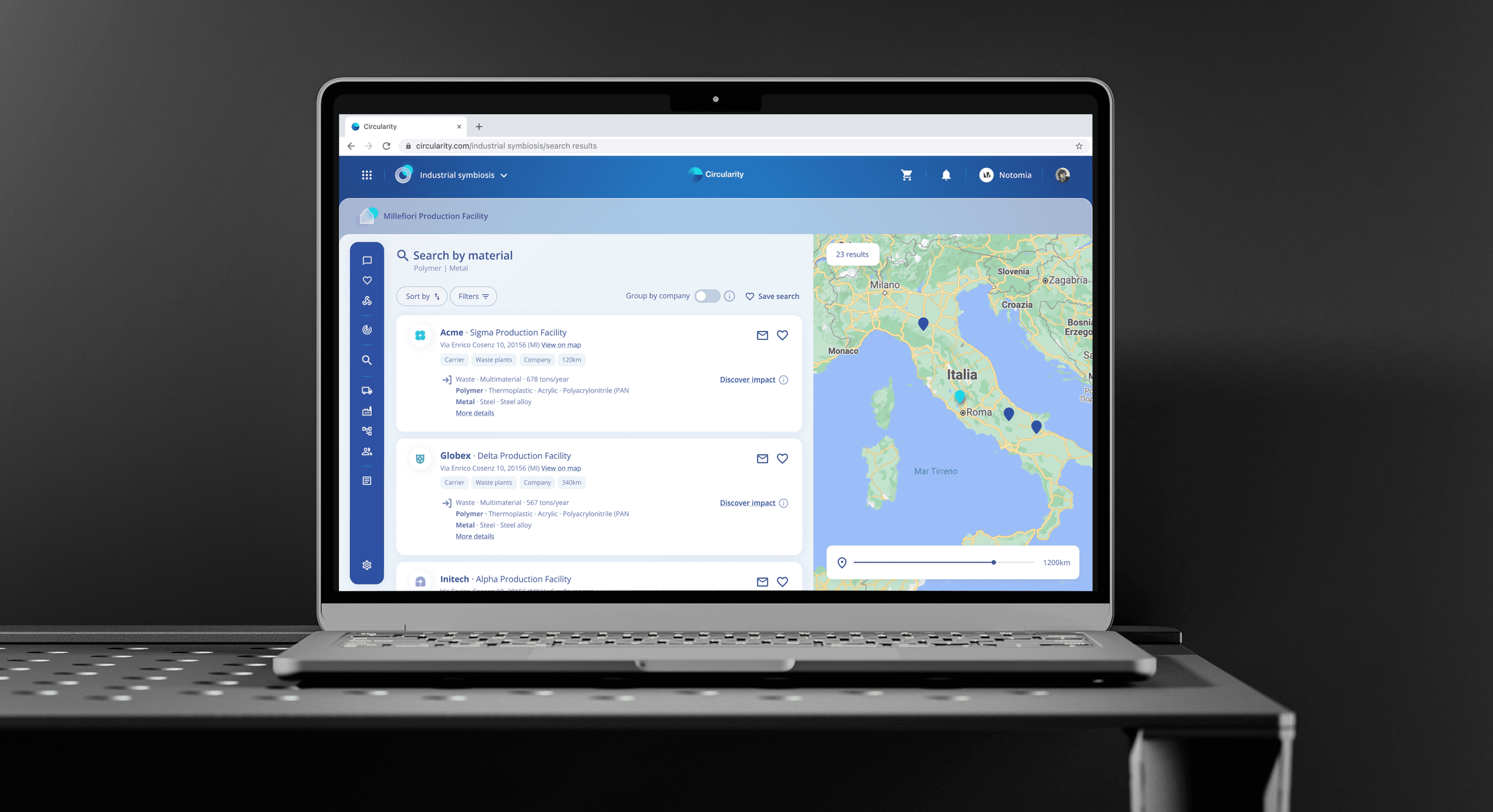
One of Circularity services connects one company's waste outflows with another's material needs, so what one discards becomes another's raw material. The design problem was making those matches findable, helping users land on relevant ones without knowing in advance where to look. I gave them two ways in: a search where they could filter matches by the parameters that mattered to them, and an automatic tool that surfaced relevant matches on their behalf. Users who knew what they were after could go and find it; users who didn't could let the system bring matches to them.
DESIGN DECISION: MATCHING TOOL
How do you help users find the right match without knowing where to look?
One of Circularity services connects one company's waste outflows with another's material needs, so what one discards becomes another's raw material. The design problem was making those matches findable, helping users land on relevant ones without knowing in advance where to look. I gave them two ways in: a search where they could filter matches by the parameters that mattered to them, and an automatic tool that surfaced relevant matches on their behalf. Users who knew what they were after could go and find it; users who didn't could let the system bring matches to them.
DESIGN DECISION: MATCHING TOOL
How do you help users find the right match without knowing where to look?
One of Circularity services connects one company's waste outflows with another's material needs, so what one discards becomes another's raw material. The design problem was making those matches findable, helping users land on relevant ones without knowing in advance where to look. I gave them two ways in: a search where they could filter matches by the parameters that mattered to them, and an automatic tool that surfaced relevant matches on their behalf. Users who knew what they were after could go and find it; users who didn't could let the system bring matches to them.

DESIGN SYSTEM
How do you make services that do different jobs feel like one brand?
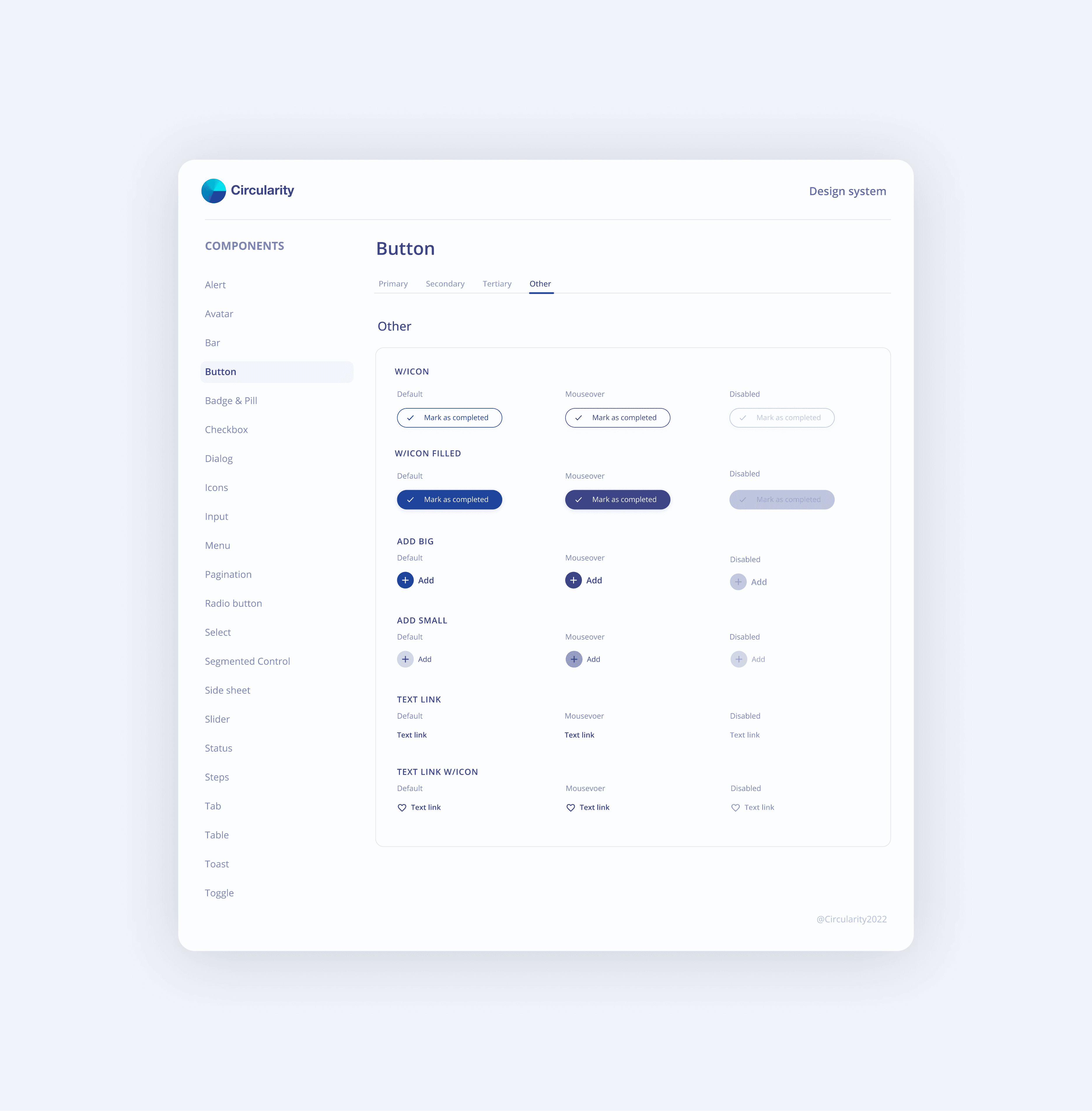
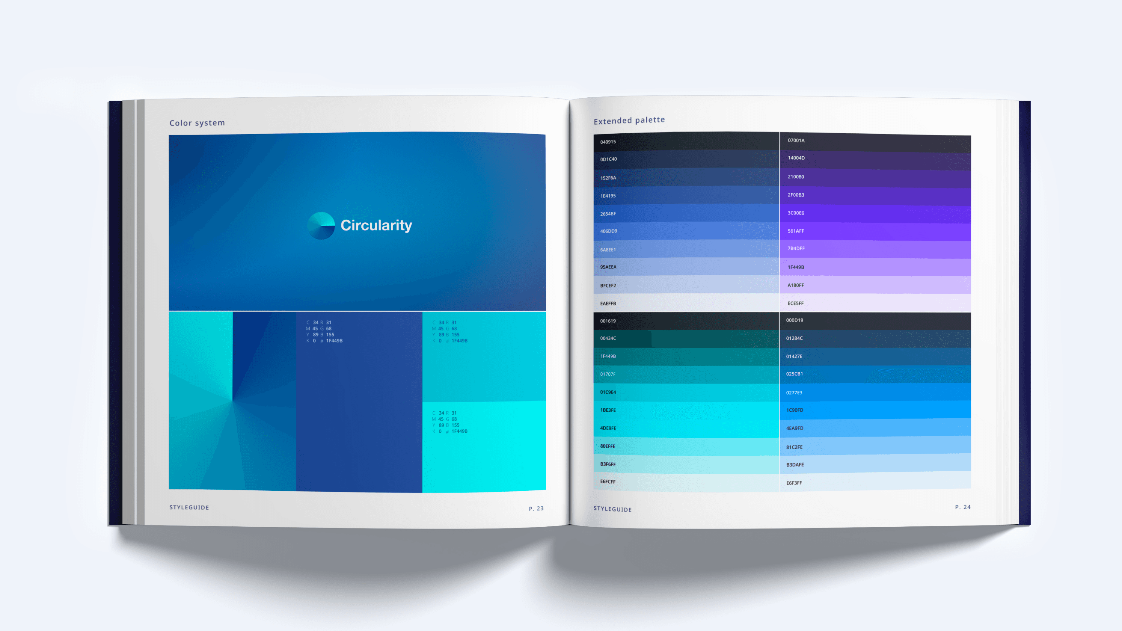
Every service is built from the same components, patterns and rules, so the product feels like one thing even though the three services do very different work. The system was made for dense, data-heavy interfaces, the kind of high-volume, information-rich screens most consumer products never have to handle. Components were designed to stay legible and usable when a screen carries far more data than a typical UI. The result is a product that holds together visually and behaviourally across every service, at the scale its users actually work.
DESIGN SYSTEM
How do you make services that do different jobs feel like one brand?
Every service is built from the same components, patterns and rules, so the product feels like one thing even though the three services do very different work. The system was made for dense, data-heavy interfaces, the kind of high-volume, information-rich screens most consumer products never have to handle. Components were designed to stay legible and usable when a screen carries far more data than a typical UI. The result is a product that holds together visually and behaviourally across every service, at the scale its users actually work.
DESIGN SYSTEM
How do you make services that do different jobs feel like one brand?
Every service is built from the same components, patterns and rules, so the product feels like one thing even though the three services do very different work. The system was made for dense, data-heavy interfaces, the kind of high-volume, information-rich screens most consumer products never have to handle. Components were designed to stay legible and usable when a screen carries far more data than a typical UI. The result is a product that holds together visually and behaviourally across every service, at the scale its users actually work.
LEARNINGS
Let confident and uncertain users take different paths to the same result
Circularity to me is an example of how designing for the happy path isn't enough. With 20,000 companies entering dense, technical data at very different levels of confidence, one path through the product fits almost no one. The lesson I kept is to offer more than one route to the same result, which is why material entry has two modes and finding a match works by search or by suggestion. When a product depends this heavily on what users put in, meeting them where they are is what keeps the data accurate enough to trust.
LEARNINGS
Let confident and uncertain users take different paths to the same result
Circularity to me is an example of how designing for the happy path isn't enough. With 20,000 companies entering dense, technical data at very different levels of confidence, one path through the product fits almost no one. The lesson I kept is to offer more than one route to the same result, which is why material entry has two modes and finding a match works by search or by suggestion. When a product depends this heavily on what users put in, meeting them where they are is what keeps the data accurate enough to trust.
LEARNINGS
Let confident and uncertain users take different paths to the same result
Circularity to me is an example of how designing for the happy path isn't enough. With 20,000 companies entering dense, technical data at very different levels of confidence, one path through the product fits almost no one. The lesson I kept is to offer more than one route to the same result, which is why material entry has two modes and finding a match works by search or by suggestion. When a product depends this heavily on what users put in, meeting them where they are is what keeps the data accurate enough to trust.
Next up
Next up
Next up