End-to-end design of a fintech platform where beginners and experienced investors build the workspace that fits them to manage their investment strategies.
Client
Merlin Investor
Industry
Fintech
Year
2022
Methodology
Agile
Role
Lead product designer
Team
Project manager Design director Lead product designer Logo designer Full-stack developers Back-end developers Front-end developers
End-to-end design of a fintech platform where beginners and experienced investors build the workspace that fits them to manage their investment strategies.
Client
Merlin Investor
Industry
Fintech
Year
2022
Methodology
Agile
Role
Lead product designer
Team
Project manager Design director Lead product designer Logo designer Full-stack developers Back-end developers Front-end developers
End-to-end design of a fintech platform where beginners and experienced investors build the workspace that fits them to manage their investment strategies.
Client
Merlin Investor
Industry
Fintech
Year
2022
Methodology
Agile
Role
Lead product designer
Team
Project manager Design director Lead product designer Logo designer Full-stack developers Back-end developers Front-end developers
CHALLENGE
Making investing approachable for beginners without limiting experts
Merlin had to work for complete beginners and experienced investors in the same product, without splitting into two. For someone with no financial literacy, the tools had to be approachable enough to use without feeling lost, while still being real enough to invest consciously rather than blindly. For a more experienced investor, the same product had to offer depth and control, not a simplified version that held them back. The problem was serving both ends of that range at once, without forcing either group through an experience built for the other.
CHALLENGE
Making investing approachable for beginners without limiting experts
Merlin had to work for complete beginners and experienced investors in the same product, without splitting into two. For someone with no financial literacy, the tools had to be approachable enough to use without feeling lost, while still being real enough to invest consciously rather than blindly. For a more experienced investor, the same product had to offer depth and control, not a simplified version that held them back. The problem was serving both ends of that range at once, without forcing either group through an experience built for the other.
CHALLENGE
Making investing approachable for beginners without limiting experts
Merlin had to work for complete beginners and experienced investors in the same product, without splitting into two. For someone with no financial literacy, the tools had to be approachable enough to use without feeling lost, while still being real enough to invest consciously rather than blindly. For a more experienced investor, the same product had to offer depth and control, not a simplified version that held them back. The problem was serving both ends of that range at once, without forcing either group through an experience built for the other.

A workspace each investor builds for themselves
OUTCOME AND IMPACT
A workspace each investor builds for themselves
Merlin works as one product across every level of financial literacy. Instead of forcing one fixed experience, it lets each person build a workspace from a library of widgets, so a beginner starts simple and an experienced investor builds something dense and analytical, pulling from 20+ data sources across markets, ETFs, bonds and crypto. The same system holds across mobile and desktop, with a full design system and brand built end to end. The product shipped and went on to win several awards in the fintech industry.
40+
widgets
10
type of assets
20+
sources of data
A workspace each investor builds for themselves
OUTCOME AND IMPACT
A workspace each investor builds for themselves
Merlin works as one product across every level of financial literacy. Instead of forcing one fixed experience, it lets each person build a workspace from a library of widgets, so a beginner starts simple and an experienced investor builds something dense and analytical, pulling from 20+ data sources across markets, ETFs, bonds and crypto. The same system holds across mobile and desktop, with a full design system and brand built end to end. The product shipped and went on to win several awards in the fintech industry.
40+
widgets
10
type of assets
20+
sources of data
OUTCOME AND IMPACT
A workspace each investor builds for themselves
Merlin works as one product across every level of financial literacy. Instead of forcing one fixed experience, it lets each person build a workspace from a library of widgets, so a beginner starts simple and an experienced investor builds something dense and analytical, pulling from 20+ data sources across markets, ETFs, bonds and crypto. The same system holds across mobile and desktop, with a full design system and brand built end to end. The product shipped and went on to win several awards in the fintech industry.
40+
widgets
10
type of assets
20+
sources of data
DESIGN DECISION: PERSONALIZATION
How do you build one workspace that grows with the user?
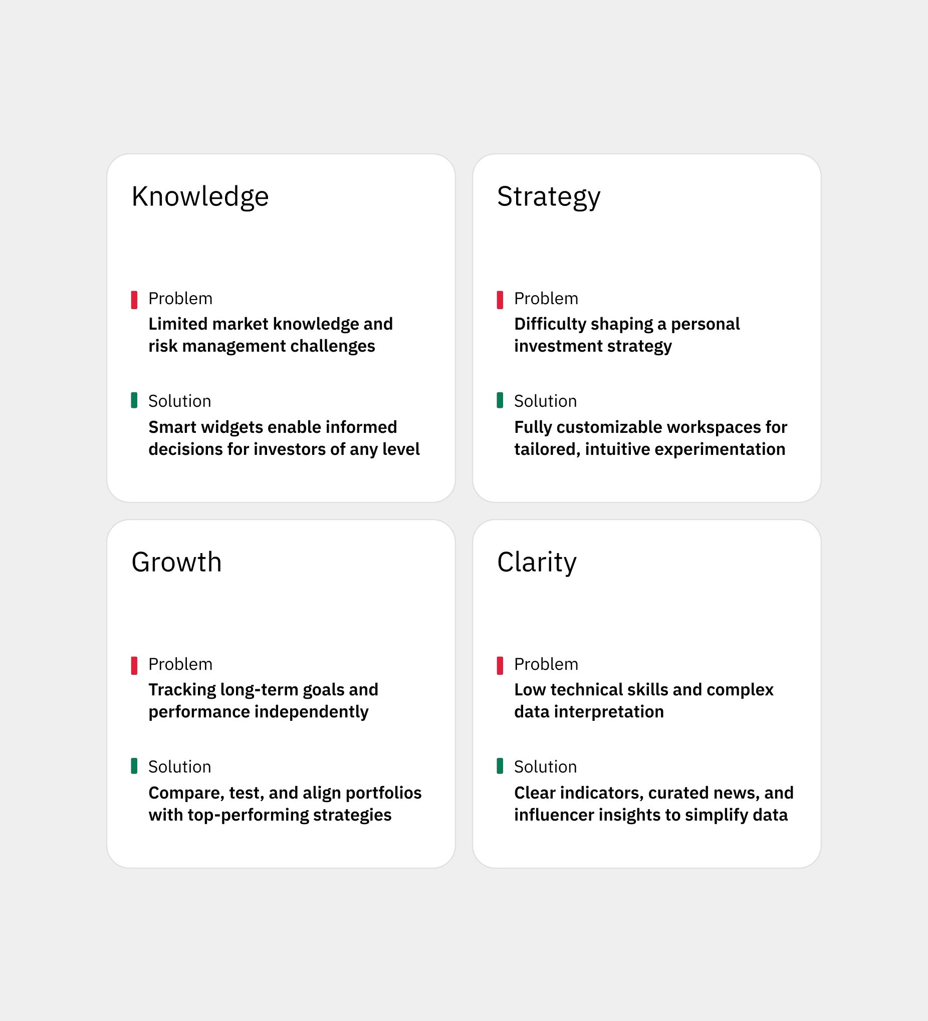
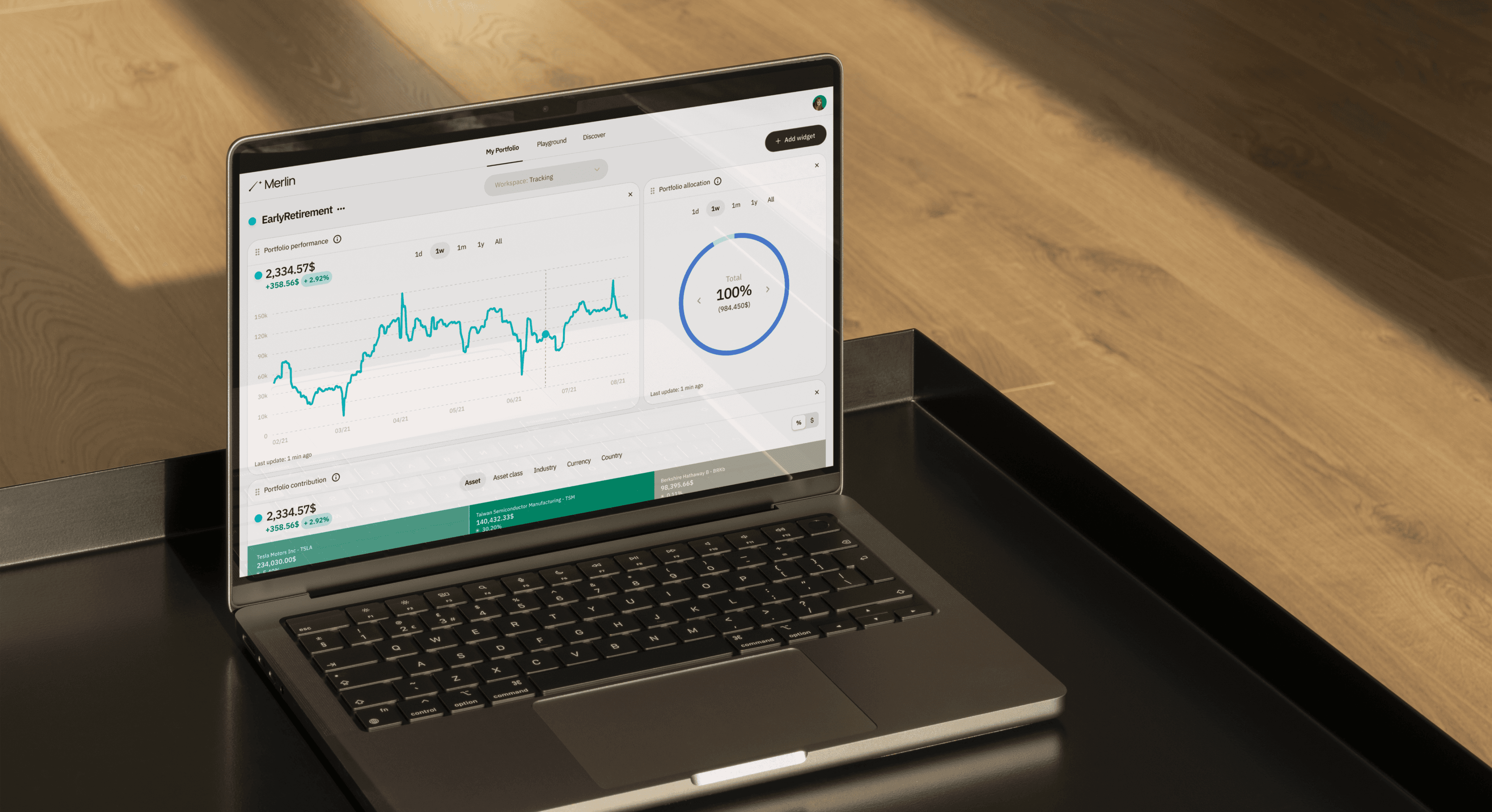
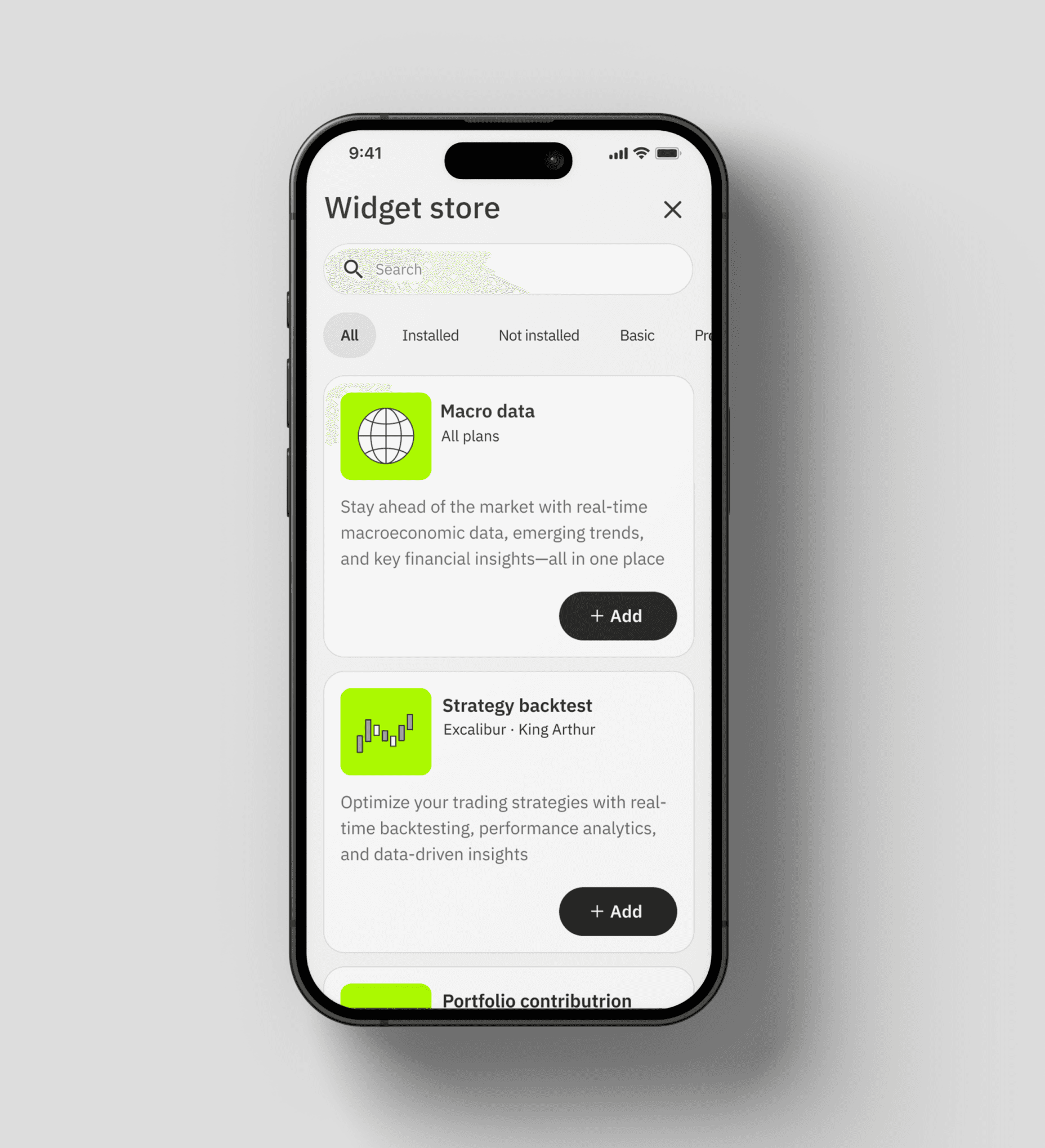
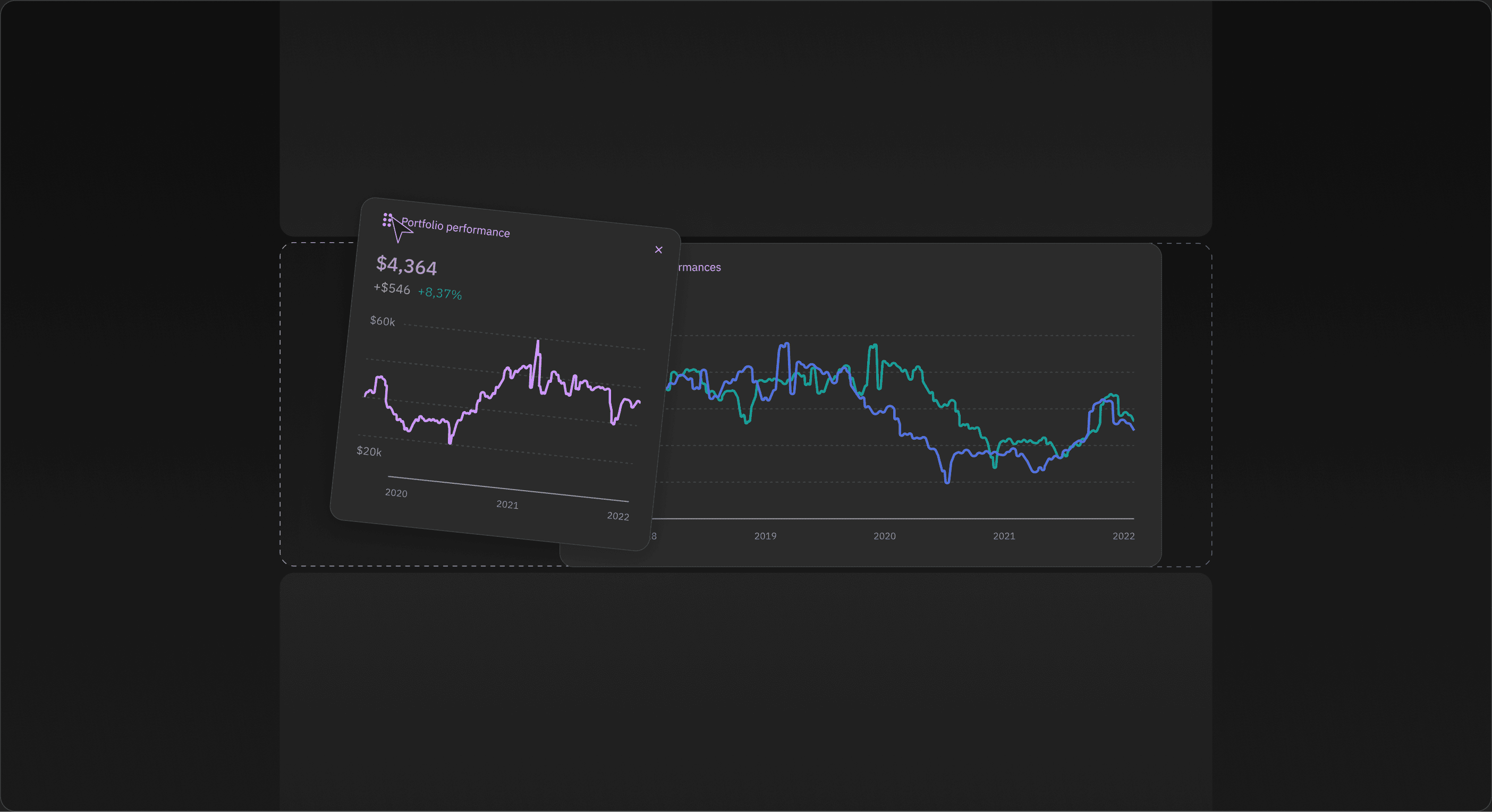
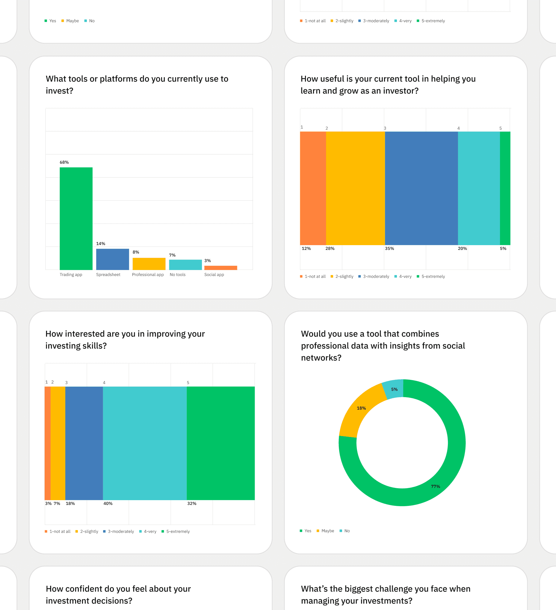
Research surfaced two groups pulling in opposite directions: younger investors who were already investing but lacked the basics and wanted to learn, and experienced ones who had the knowledge and wanted more control. A single fixed product would have failed one or the other, so I designed a widget store instead: a library of 40+ components, from simple tools anyone can read to advanced ones built with the support of a financial analyst. Each person assembles their own workspace from it, adding, removing and reordering widgets as they go. One system serves both, without simplifying for the expert or overwhelming the beginner.
DESIGN DECISION: PERSONALIZATION
How do you build one workspace that grows with the user?
Research surfaced two groups pulling in opposite directions: younger investors who were already investing but lacked the basics and wanted to learn, and experienced ones who had the knowledge and wanted more control. A single fixed product would have failed one or the other, so I designed a widget store instead: a library of 40+ components, from simple tools anyone can read to advanced ones built with the support of a financial analyst. Each person assembles their own workspace from it, adding, removing and reordering widgets as they go. One system serves both, without simplifying for the expert or overwhelming the beginner.
DESIGN DECISION: PERSONALIZATION
How do you build one workspace that grows with the user?
Research surfaced two groups pulling in opposite directions: younger investors who were already investing but lacked the basics and wanted to learn, and experienced ones who had the knowledge and wanted more control. A single fixed product would have failed one or the other, so I designed a widget store instead: a library of 40+ components, from simple tools anyone can read to advanced ones built with the support of a financial analyst. Each person assembles their own workspace from it, adding, removing and reordering widgets as they go. One system serves both, without simplifying for the expert or overwhelming the beginner.

DESIGN DECISION: GUIDED INVESTING
How do you teach good investing through the product itself?
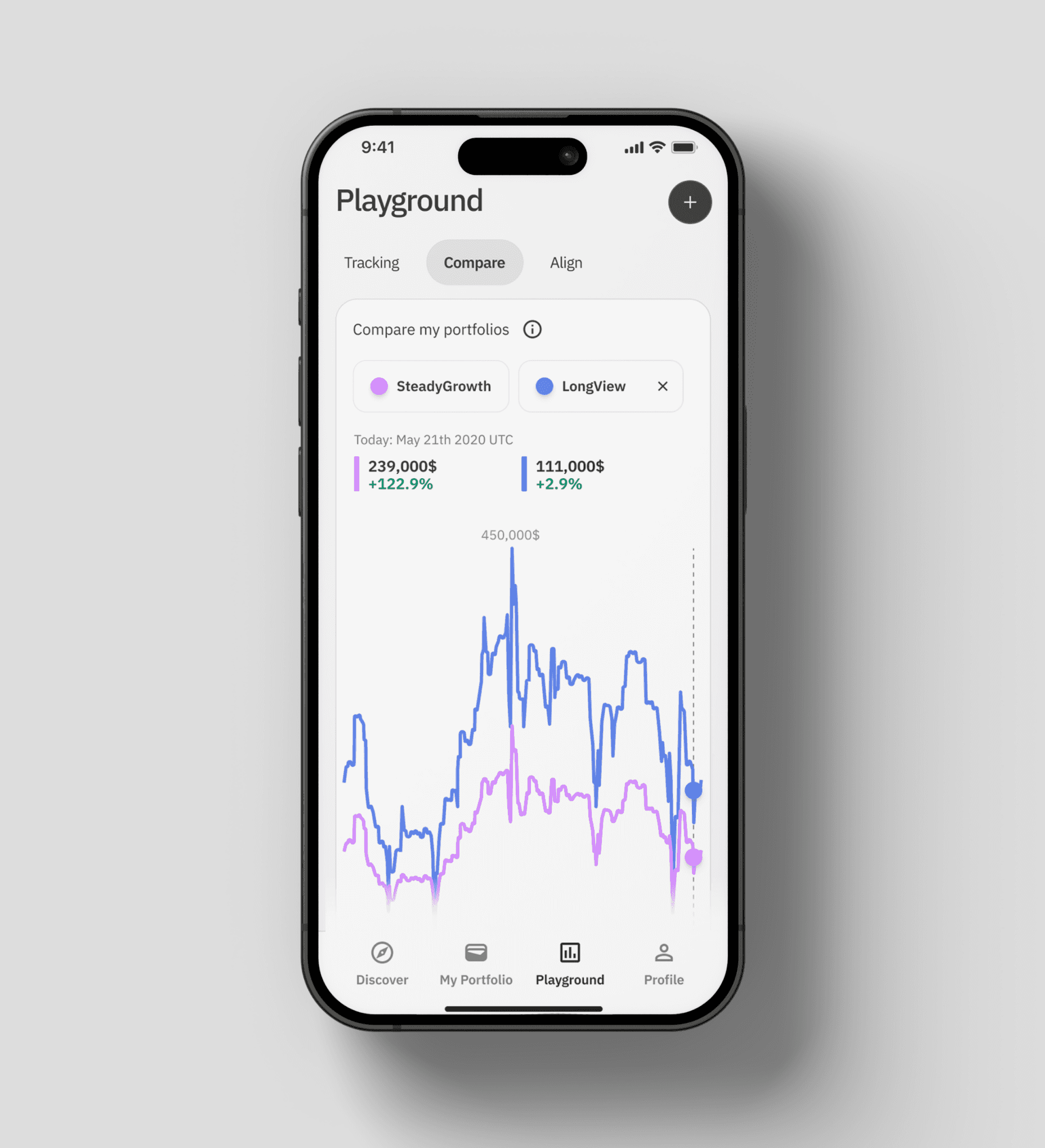
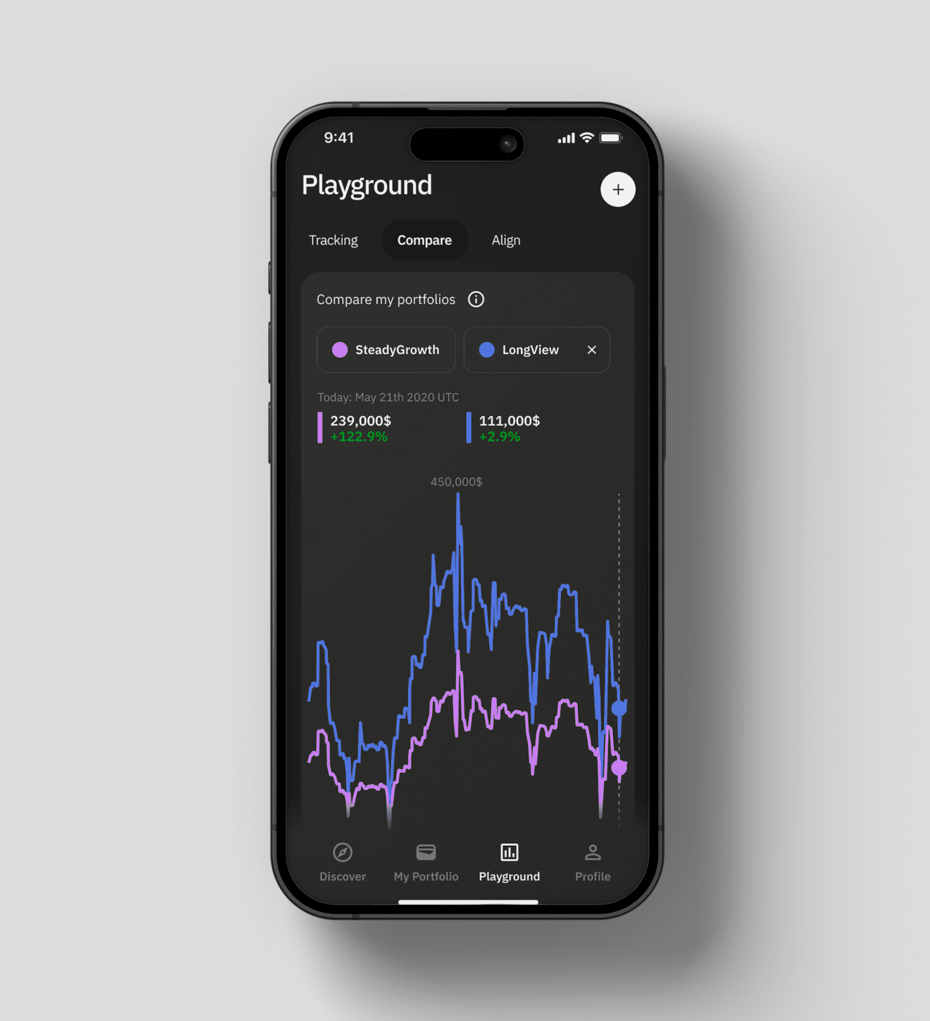
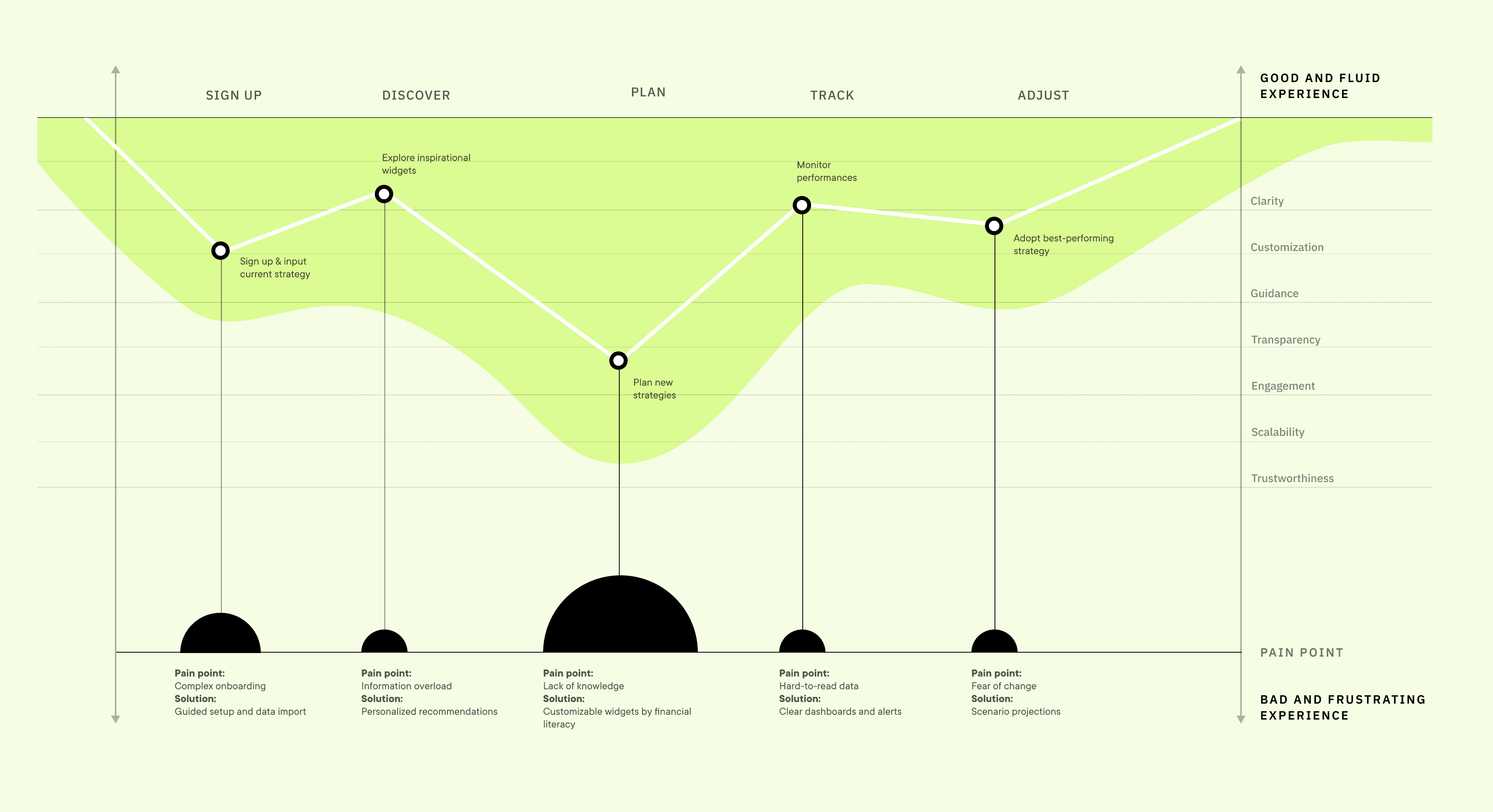
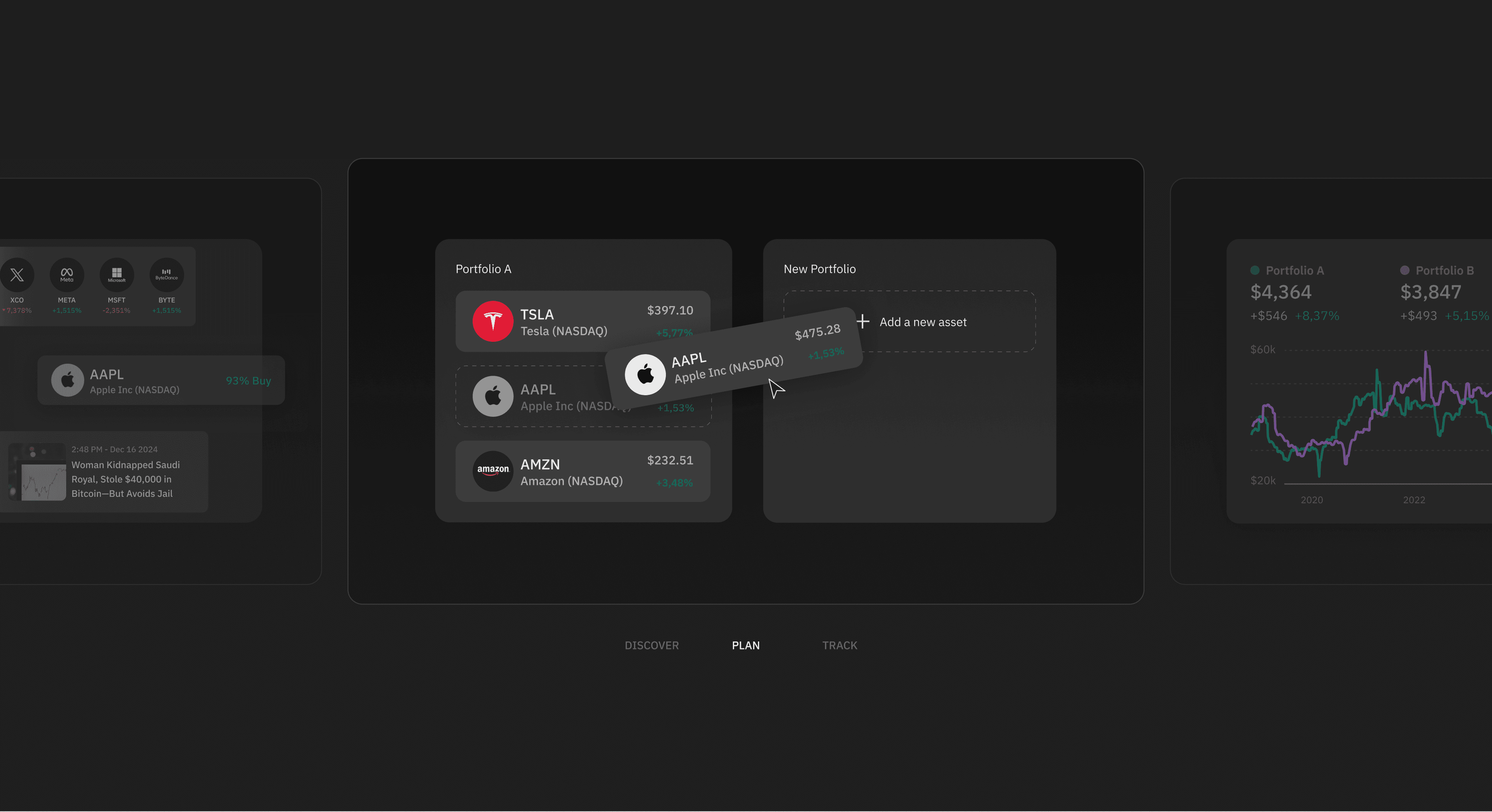
Investing well follows a path most beginners never see: research before deciding, build a strategy, then monitor and adjust it. We shaped the product around those three steps, discover, plan and track, so the structure itself teaches users how to invest with awareness. Discover pulls research and inspiration from news and social, plan turns it into a strategy, and track gives the tools to monitor it. Users can run more than one strategy at once and see how each performs against the one they actually hold, then realign when it makes sense.
DESIGN DECISION: GUIDED INVESTING
How do you teach good investing through the product itself?
Investing well follows a path most beginners never see: research before deciding, build a strategy, then monitor and adjust it. We shaped the product around those three steps, discover, plan and track, so the structure itself teaches users how to invest with awareness. Discover pulls research and inspiration from news and social, plan turns it into a strategy, and track gives the tools to monitor it. Users can run more than one strategy at once and see how each performs against the one they actually hold, then realign when it makes sense.
DESIGN DECISION: GUIDED INVESTING
How do you teach good investing through the product itself?
Investing well follows a path most beginners never see: research before deciding, build a strategy, then monitor and adjust it. We shaped the product around those three steps, discover, plan and track, so the structure itself teaches users how to invest with awareness. Discover pulls research and inspiration from news and social, plan turns it into a strategy, and track gives the tools to monitor it. Users can run more than one strategy at once and see how each performs against the one they actually hold, then realign when it makes sense.

DESIGN DECISION: VISUAL LANGUAGE
How do you make investing feel approachable instead of intimidating?
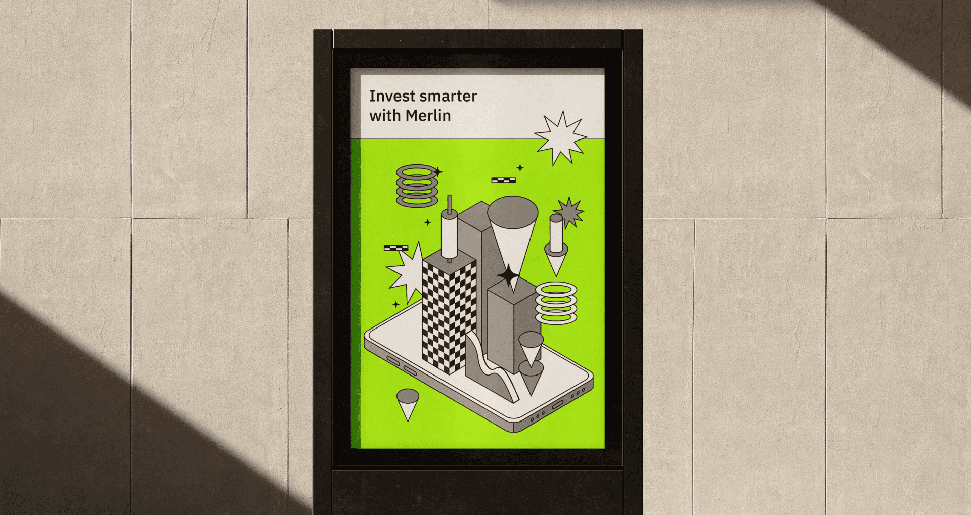
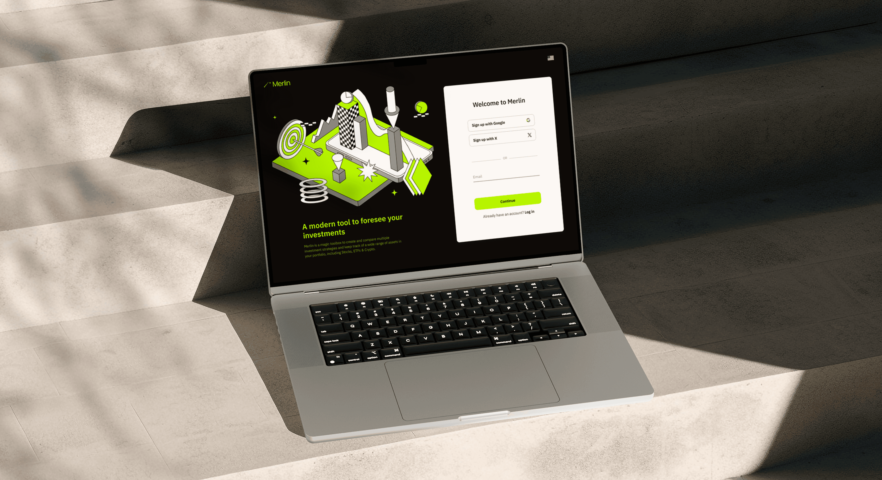
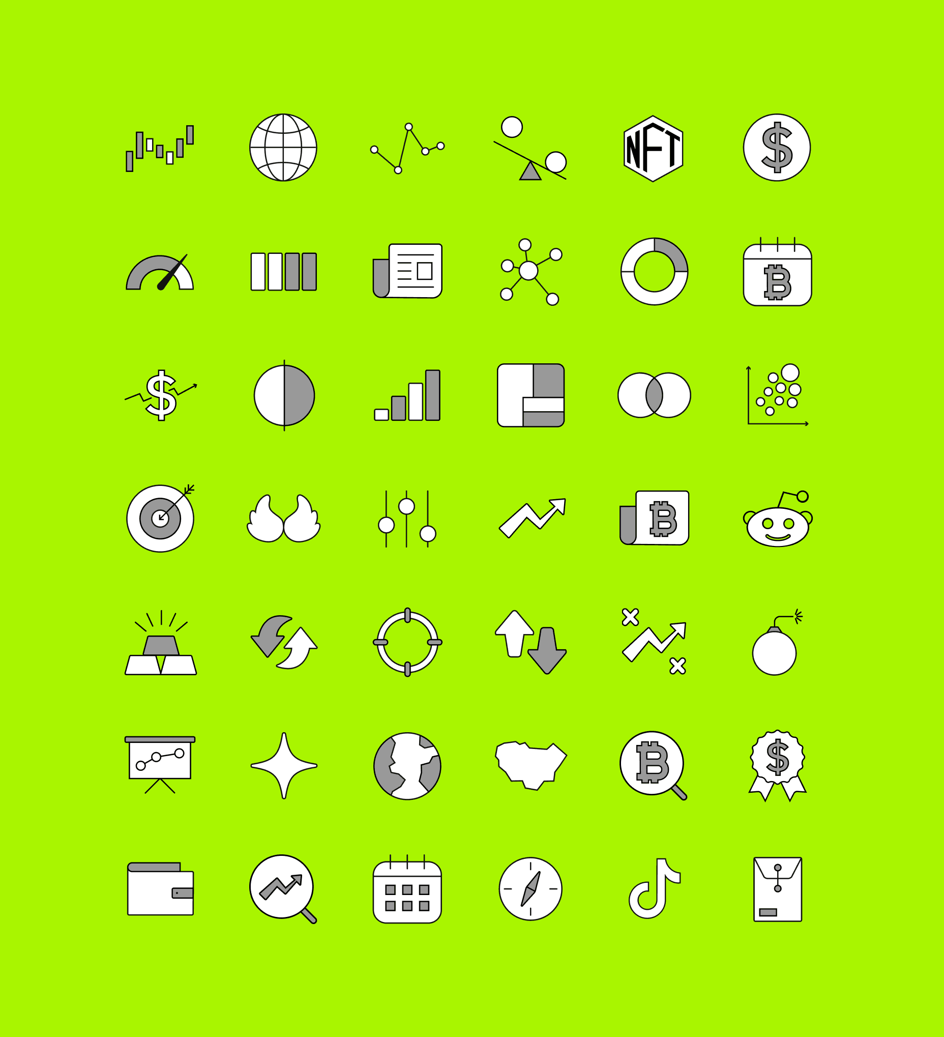
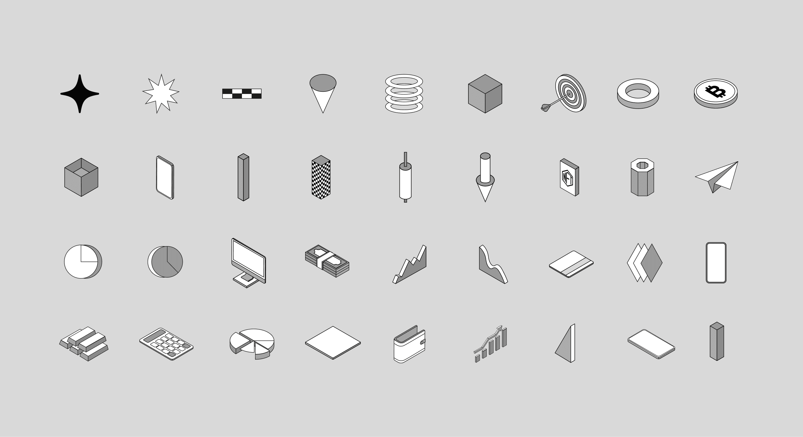
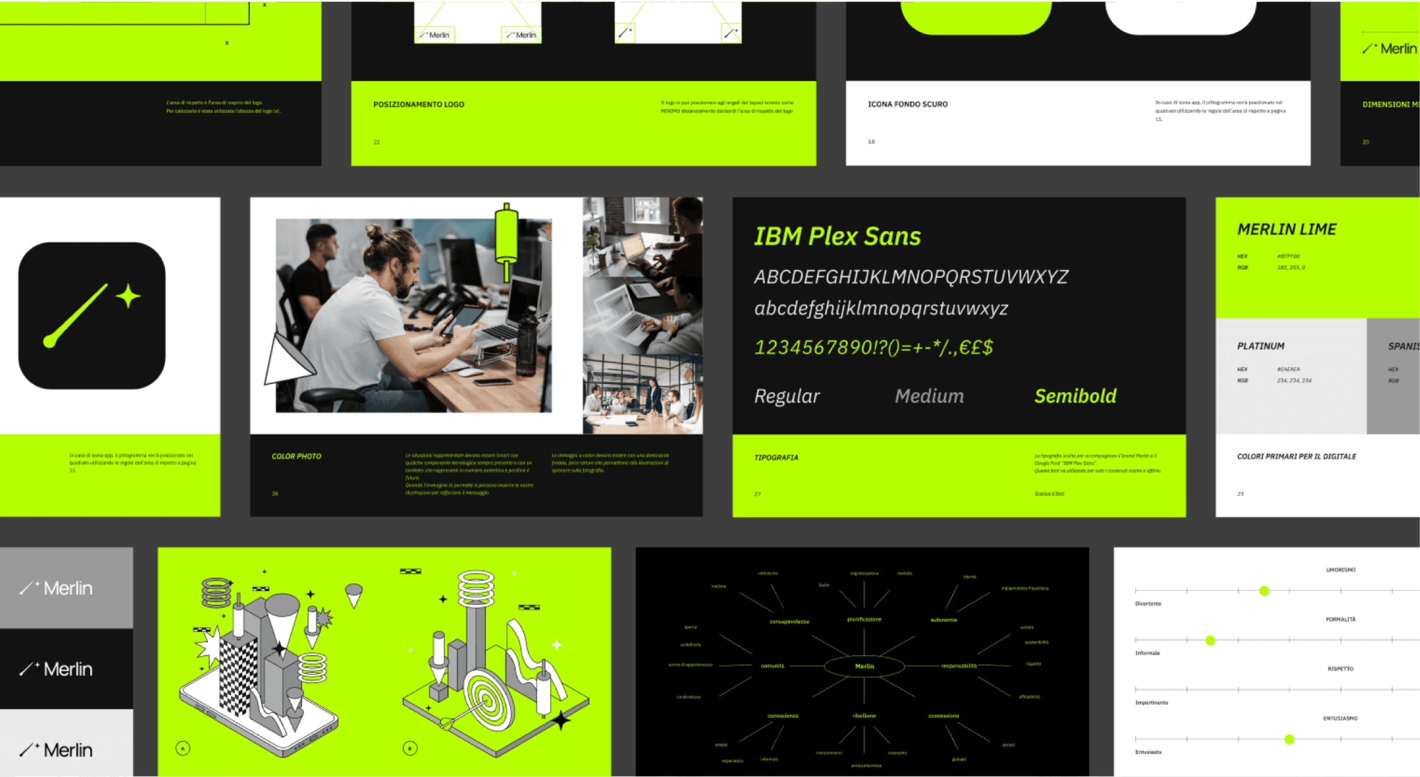
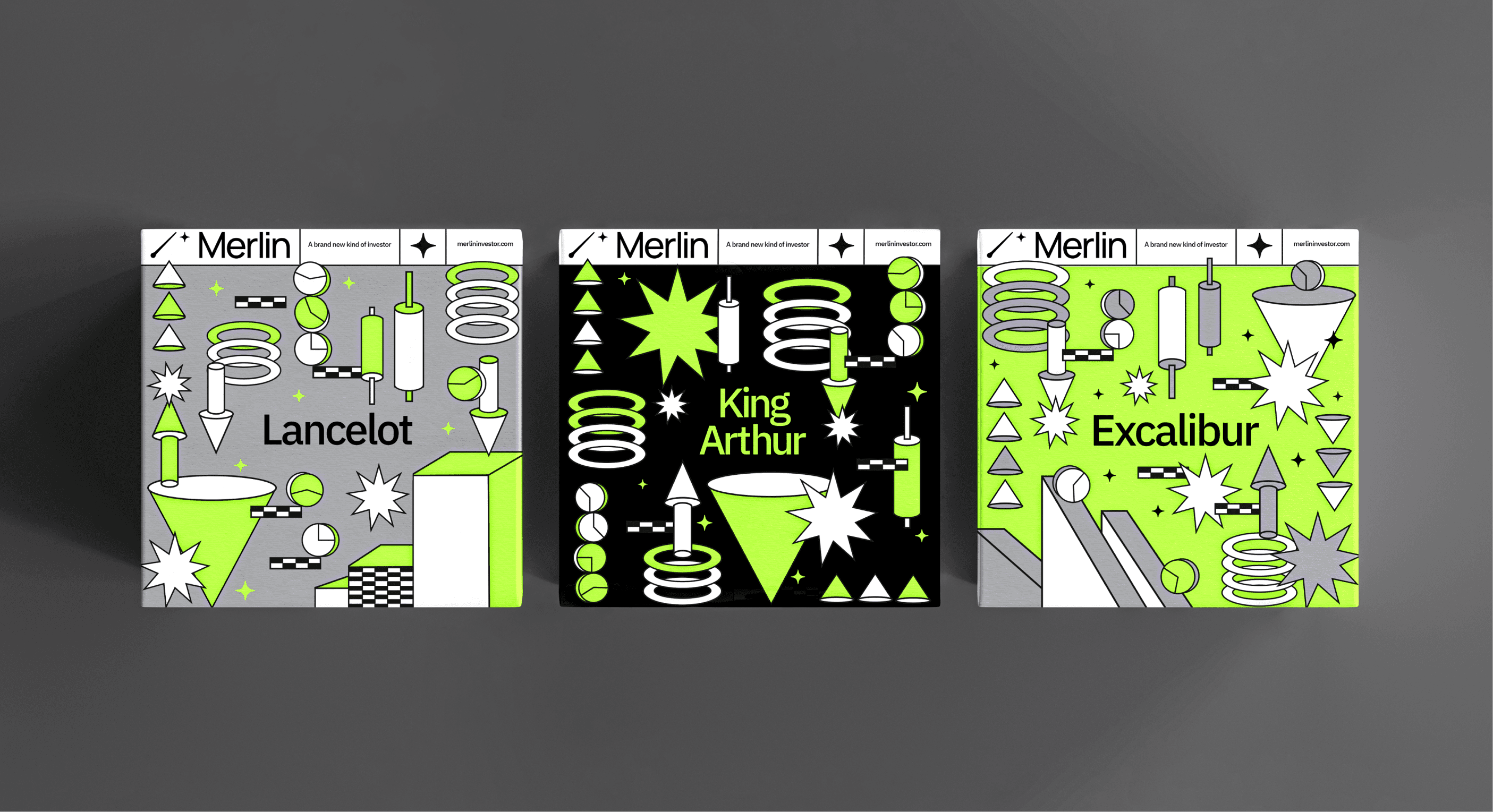
A planning-heavy investment tool risks feeling dry and corporate, exactly what pushes away the younger, less experienced users the product was built for. The visual identity was a deliberate answer to that: an energetic illustration system and a bold palette that make finance feel approachable rather than exclusive. The system carried into a tiered merchandise pack tied to subscription level, working as both a reward and a status signal as users moved up. The result is a fintech product that feels closer to something people want to use than to a tool they feel they should.
DESIGN DECISION: VISUAL LANGUAGE
How do you make investing feel approachable instead of intimidating?
A planning-heavy investment tool risks feeling dry and corporate, exactly what pushes away the younger, less experienced users the product was built for. The visual identity was a deliberate answer to that: an energetic illustration system and a bold palette that make finance feel approachable rather than exclusive. The system carried into a tiered merchandise pack tied to subscription level, working as both a reward and a status signal as users moved up. The result is a fintech product that feels closer to something people want to use than to a tool they feel they should.
DESIGN DECISION: VISUAL LANGUAGE
How do you make investing feel approachable instead of intimidating?
A planning-heavy investment tool risks feeling dry and corporate, exactly what pushes away the younger, less experienced users the product was built for. The visual identity was a deliberate answer to that: an energetic illustration system and a bold palette that make finance feel approachable rather than exclusive. The system carried into a tiered merchandise pack tied to subscription level, working as both a reward and a status signal as users moved up. The result is a fintech product that feels closer to something people want to use than to a tool they feel they should.


LEARNINGS
You don't always have to choose between simple and powerful
Serving very different users usually looks like a choice between two bad options: build one simple product that frustrates experts, or one powerful product that loses beginners. Merlin showed me a third way. Instead of designing the experience for an imagined average user, I designed the pieces and let each person assemble the depth they needed. The lesson I kept is that flexibility built into the structure can resolve a tension that looks like it needs two separate products.
LEARNINGS
You don't always have to choose between simple and powerful
Serving very different users usually looks like a choice between two bad options: build one simple product that frustrates experts, or one powerful product that loses beginners. Merlin showed me a third way. Instead of designing the experience for an imagined average user, I designed the pieces and let each person assemble the depth they needed. The lesson I kept is that flexibility built into the structure can resolve a tension that looks like it needs two separate products.
LEARNINGS
You don't always have to choose between simple and powerful
Serving very different users usually looks like a choice between two bad options: build one simple product that frustrates experts, or one powerful product that loses beginners. Merlin showed me a third way. Instead of designing the experience for an imagined average user, I designed the pieces and let each person assemble the depth they needed. The lesson I kept is that flexibility built into the structure can resolve a tension that looks like it needs two separate products.
Next up
Next up
Next up