A research-led educational app, co-designed and tested with families and children to make e-waste disposal something they actually do.
Client
Gruppo Safe
Industry
E-waste management
Year
2025
Methodology
Lean
Role
Lead product designer
Team
Project manager Lead product designer Full-stack developer
A research-led educational app, co-designed and tested with families and children to make e-waste disposal something they actually do.
Client
Gruppo Safe
Industry
E-waste management
Year
2025
Methodology
Lean
Role
Lead product designer
Team
Project manager Lead product designer Full-stack developer
A research-led educational app, co-designed and tested with families and children to make e-waste disposal something they actually do.
Client
Gruppo Safe
Industry
E-waste management
Year
2025
Methodology
Lean
Role
Lead product designer
Team
Project manager Lead product designer Full-stack developer
CHALLENGE
Sustainability content that doesn't make people switch off
Most people don't know what e-waste is or what to do with it, and sustainability content tends to lecture, which makes them tune out before they learn anything. The challenge was making technical, regulatory information genuinely engaging for families, with children as the way into the household. It had to work for a child and a parent at the same time, without talking down to either. And it had to move people to act, not just understand, since knowing about e-waste changes nothing if no one does anything differently.
CHALLENGE
Sustainability content that doesn't make people switch off
Most people don't know what e-waste is or what to do with it, and sustainability content tends to lecture, which makes them tune out before they learn anything. The challenge was making technical, regulatory information genuinely engaging for families, with children as the way into the household. It had to work for a child and a parent at the same time, without talking down to either. And it had to move people to act, not just understand, since knowing about e-waste changes nothing if no one does anything differently.
CHALLENGE
Sustainability content that doesn't make people switch off
Most people don't know what e-waste is or what to do with it, and sustainability content tends to lecture, which makes them tune out before they learn anything. The challenge was making technical, regulatory information genuinely engaging for families, with children as the way into the household. It had to work for a child and a parent at the same time, without talking down to either. And it had to move people to act, not just understand, since knowing about e-waste changes nothing if no one does anything differently.
An app families use, shaped by the families who tested it
OUTCOME AND IMPACT
An app families use, shaped by the families who tested it
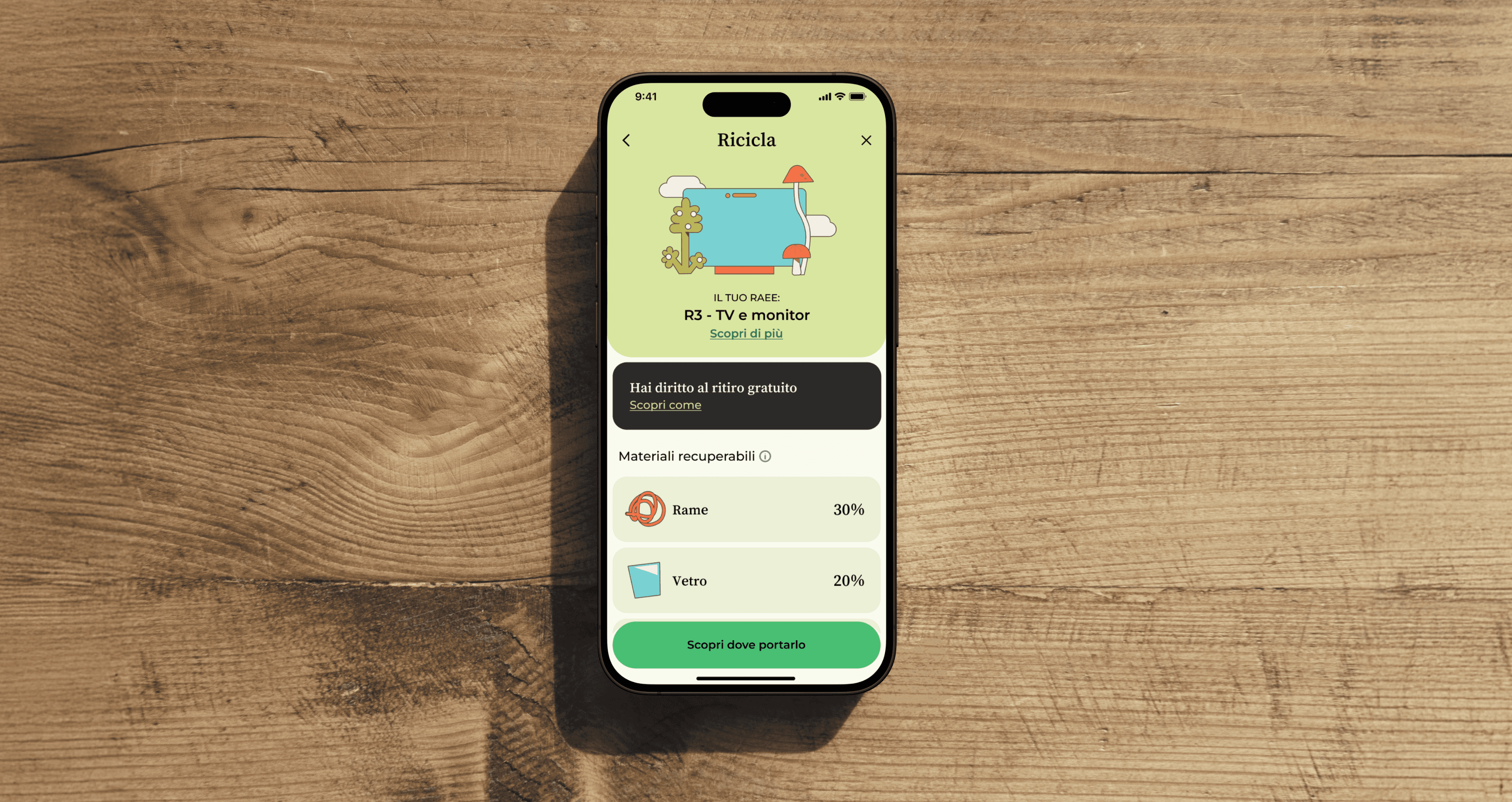
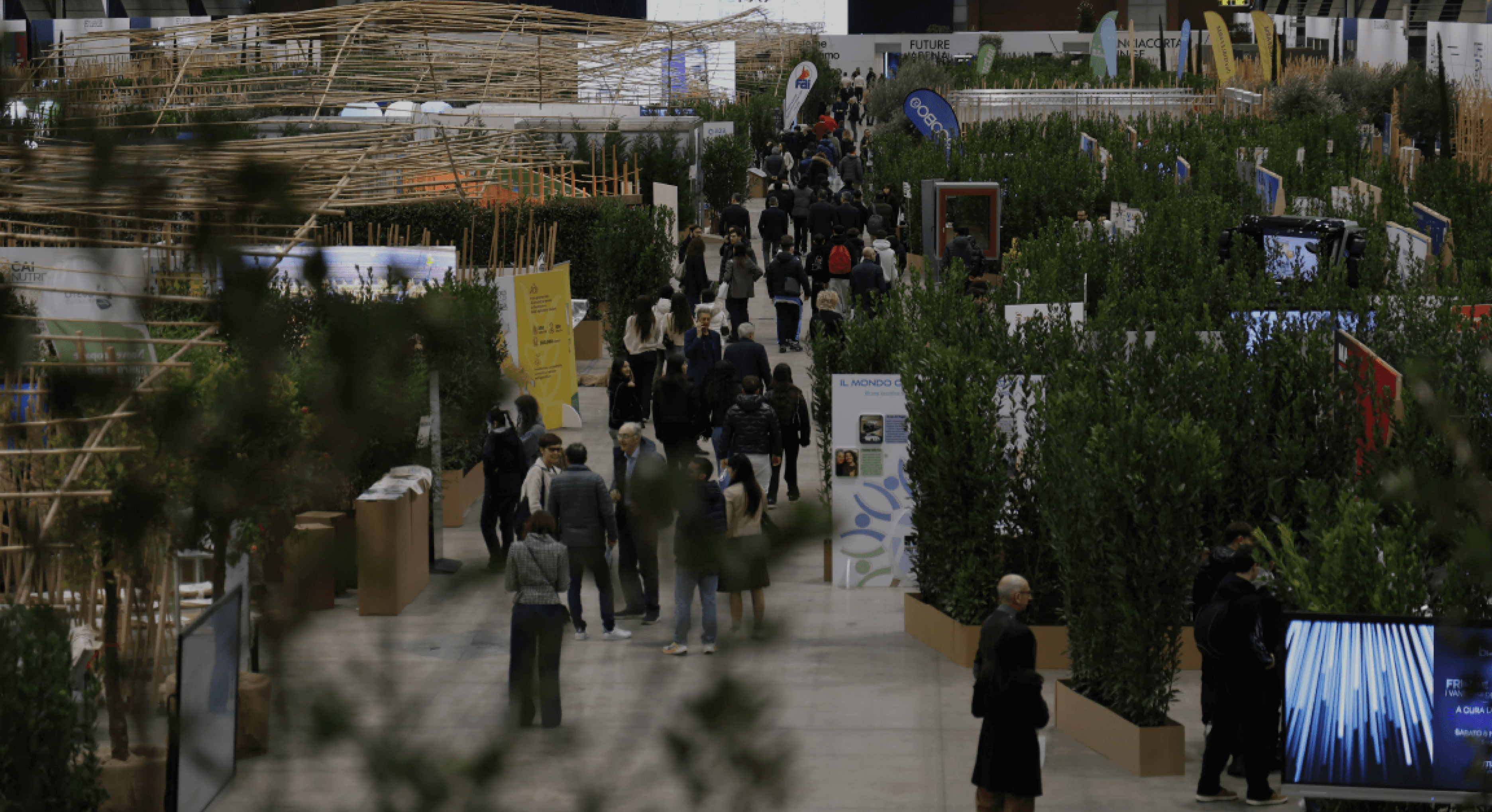
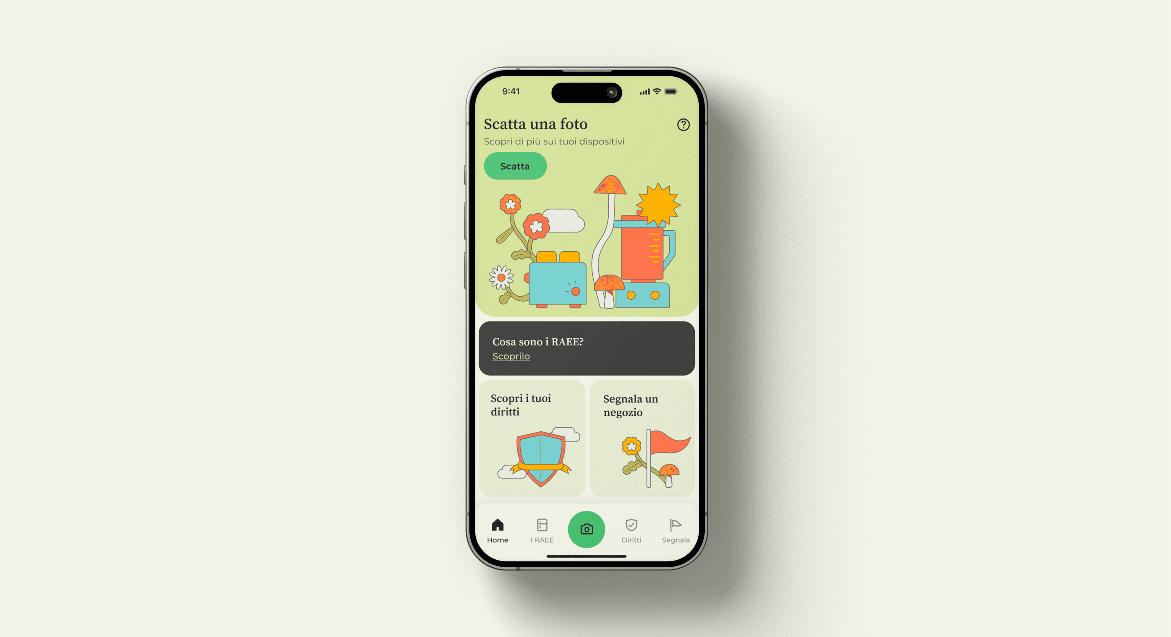
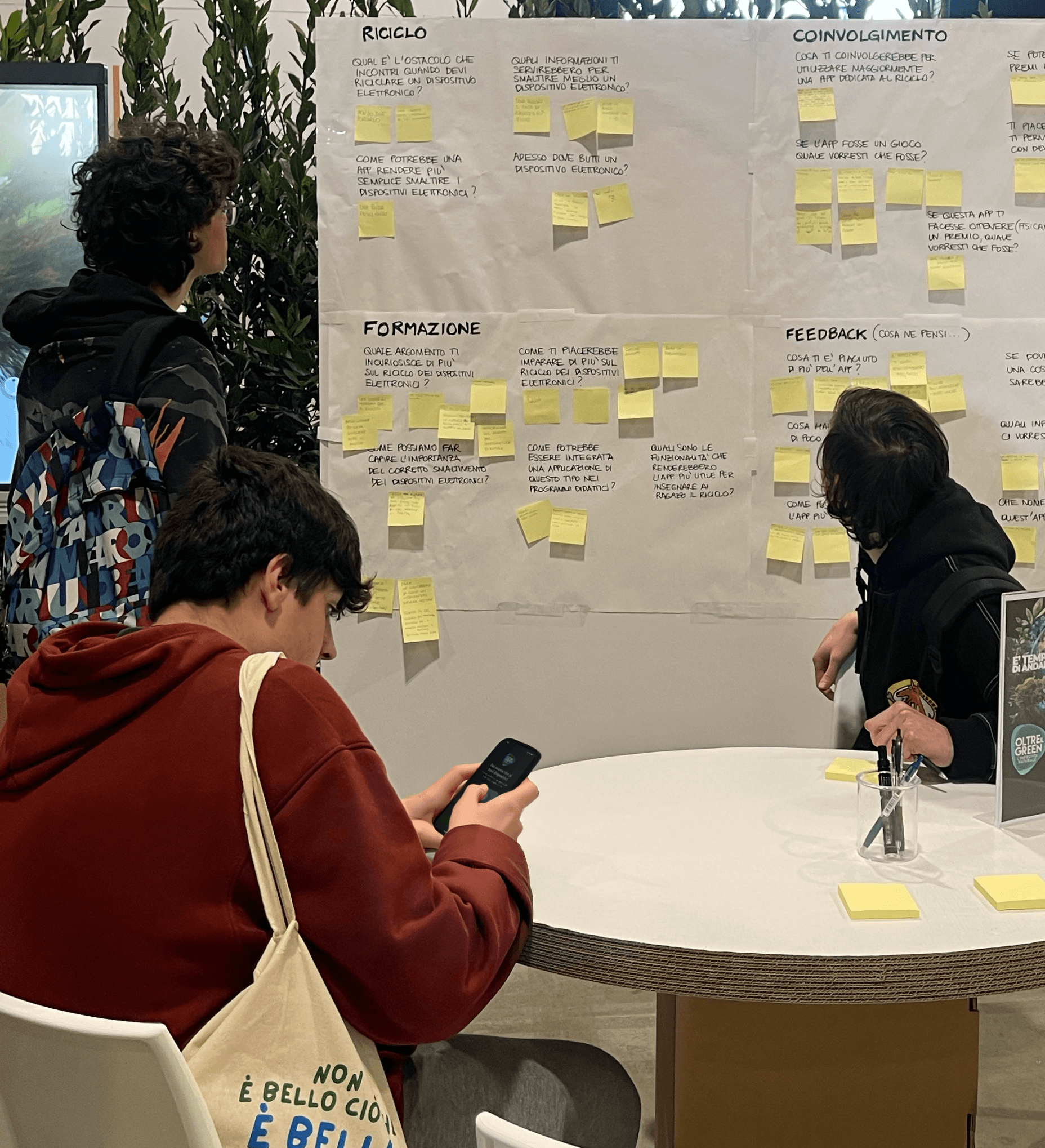
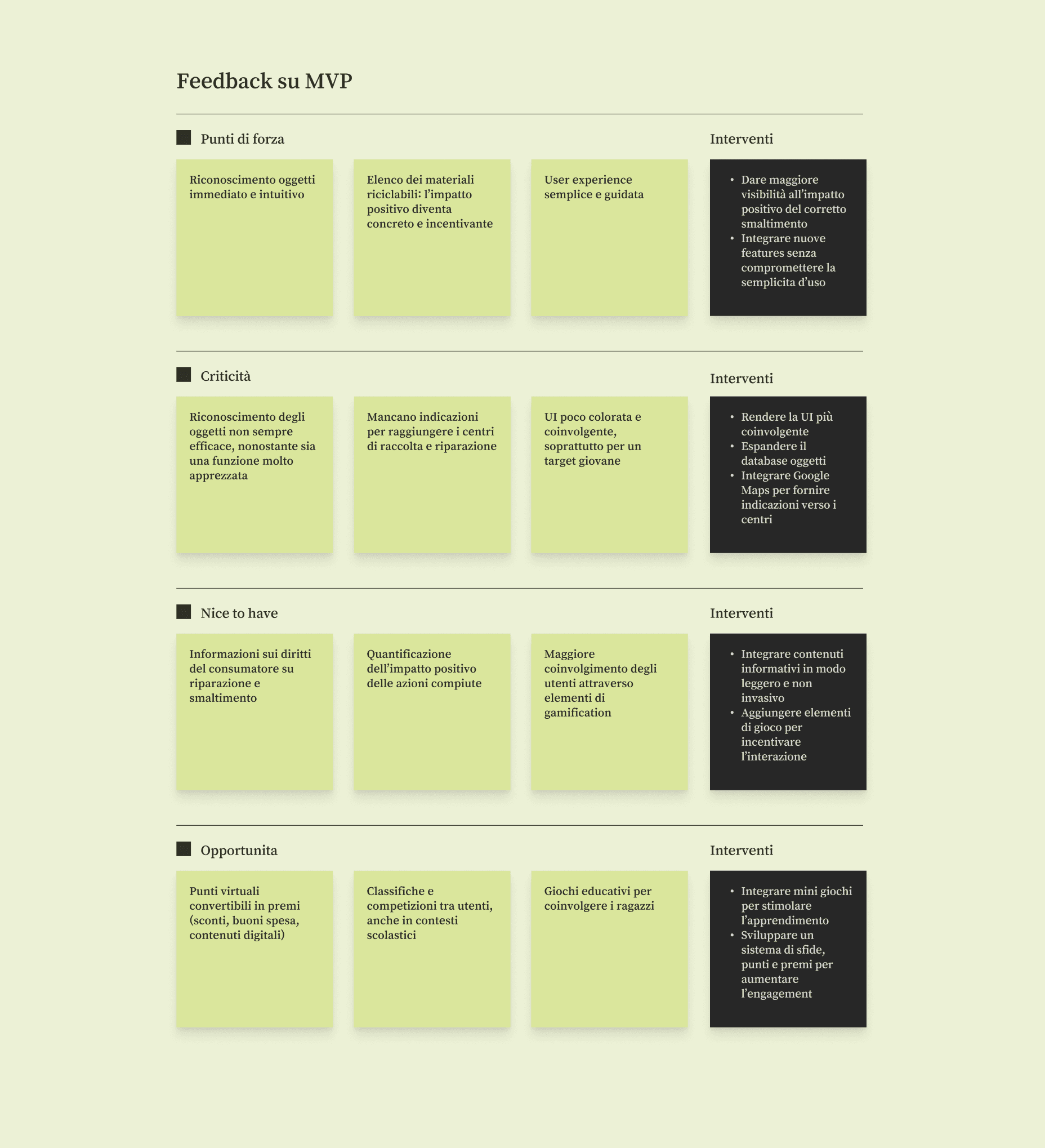
MyRaee turns e-waste disposal into something families do rather than read about: you photograph a device, the app identifies it and you get clear next steps for repair or recycling, including the nearest drop-off point. The experience was shaped through live testing with over 100 families and children, which pushed it toward radical simplicity and usefulness over instruction. It was endorsed by Regione Lombardia, which is preparing to bring it into schools.
50+
illustration components
100+
users involved in live testing
1
endorsement by Regione Lombardia
An app families use, shaped by the families who tested it
OUTCOME AND IMPACT
An app families use, shaped by the families who tested it
MyRaee turns e-waste disposal into something families do rather than read about: you photograph a device, the app identifies it and you get clear next steps for repair or recycling, including the nearest drop-off point. The experience was shaped through live testing with over 100 families and children, which pushed it toward radical simplicity and usefulness over instruction. It was endorsed by Regione Lombardia, which is preparing to bring it into schools.
50+
illustration components
100+
users involved in live testing
1
endorsement by Regione Lombardia
OUTCOME AND IMPACT
An app families use, shaped by the families who tested it
MyRaee turns e-waste disposal into something families do rather than read about: you photograph a device, the app identifies it and you get clear next steps for repair or recycling, including the nearest drop-off point. The experience was shaped through live testing with over 100 families and children, which pushed it toward radical simplicity and usefulness over instruction. It was endorsed by Regione Lombardia, which is preparing to bring it into schools.
50+
illustration components
100+
users involved in live testing
1
endorsement by Regione Lombardia
DESIGN DECISION: ACTION-FIRST PRINCIPLE
How do you make a boring task something people want to do?
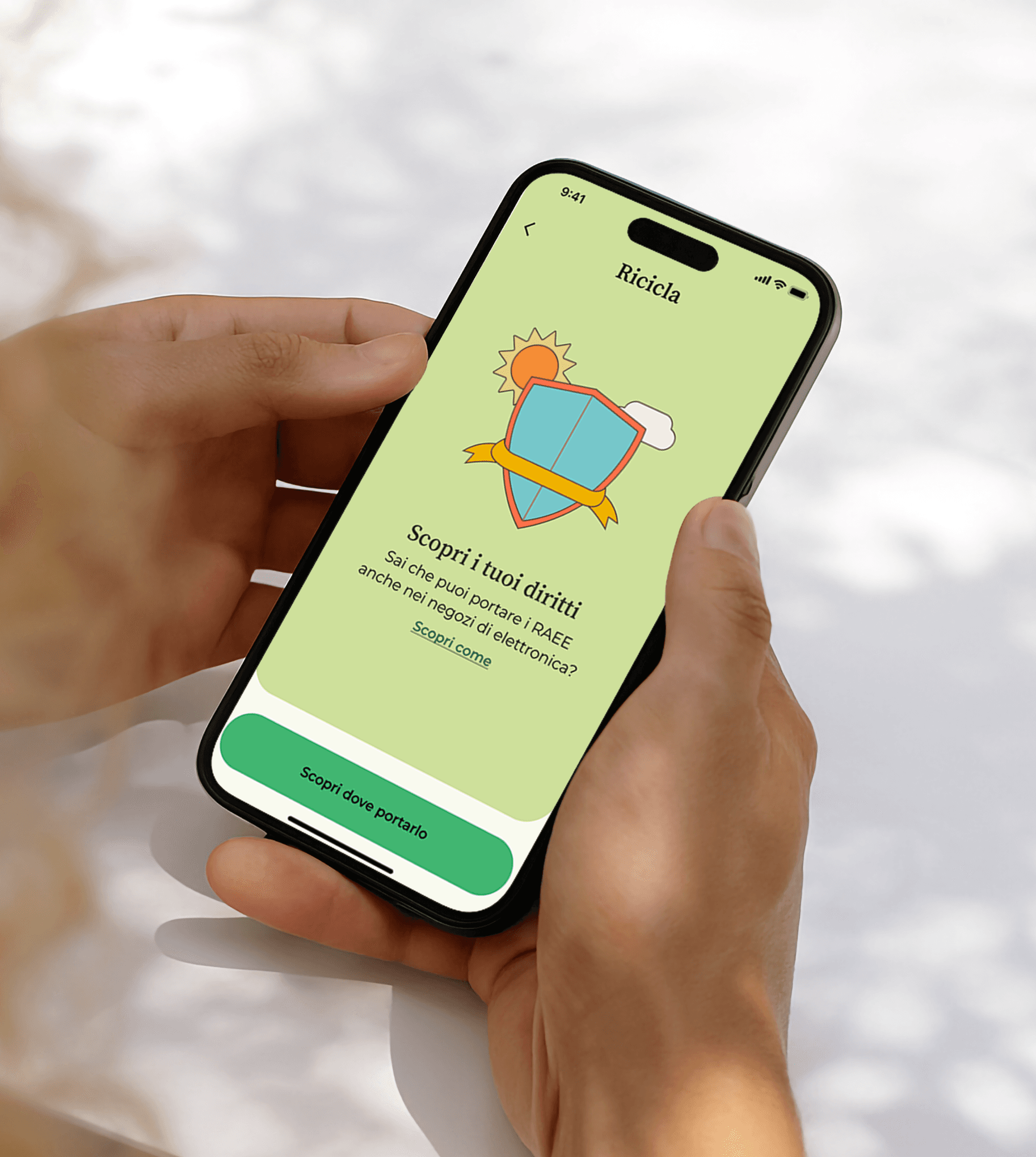
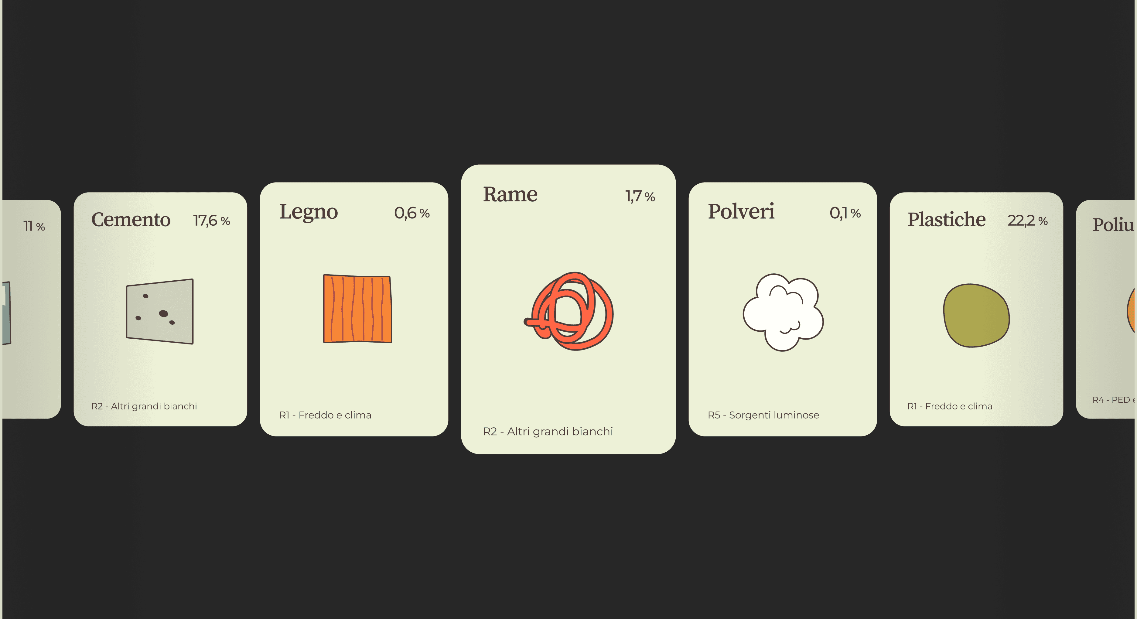
Instead of explaining why e-waste matters, the app guides the user through doing something about it: recycling or repairing a specific object, step by step. The education happens along the way, inside a task people already have a reason to complete, rather than as a lecture they have to sit through first. Live testing surfaced what actually motivated people, so the app both simplifies the task as much as possible and shows the concrete result of each action: how many materials get recovered from the object in your hands, working as both an incentive to start and a reward for finishing.
DESIGN DECISION: ACTION-FIRST PRINCIPLE
How do you make a boring task something people want to do?
Instead of explaining why e-waste matters, the app guides the user through doing something about it: recycling or repairing a specific object, step by step. The education happens along the way, inside a task people already have a reason to complete, rather than as a lecture they have to sit through first. Live testing surfaced what actually motivated people, so the app both simplifies the task as much as possible and shows the concrete result of each action: how many materials get recovered from the object in your hands, working as both an incentive to start and a reward for finishing.
DESIGN DECISION: ACTION-FIRST PRINCIPLE
How do you make a boring task something people want to do?
Instead of explaining why e-waste matters, the app guides the user through doing something about it: recycling or repairing a specific object, step by step. The education happens along the way, inside a task people already have a reason to complete, rather than as a lecture they have to sit through first. Live testing surfaced what actually motivated people, so the app both simplifies the task as much as possible and shows the concrete result of each action: how many materials get recovered from the object in your hands, working as both an incentive to start and a reward for finishing.
DESIGN DECISION: IMAGE RECOGNITION
How do you make recycling e-waste as simple as taking a photo?
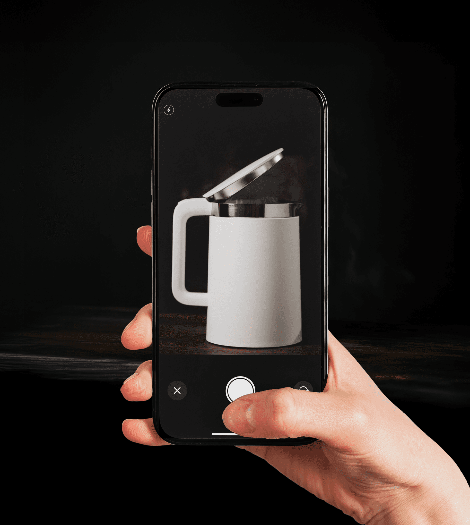
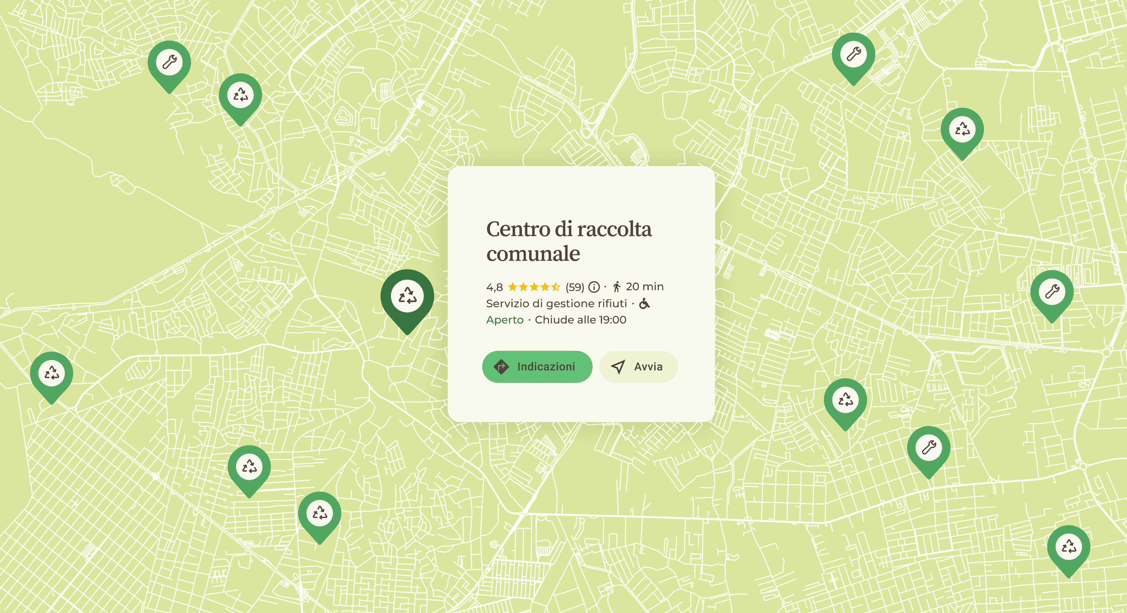
The whole flow had to be as short as possible: photograph a device, get its classification and go straight to the nearest collection centre with directions ready in the app. The risk was the moment the AI couldn't recognise something (air fryers, for some reason), breaking that simplicity. So I kept the fallback path just as short: the user picks the category and brand by hand and continues to the same outcome, no error, no restart. That manual step did double duty, the user still reaches their goal in a few taps, and every correction becomes data to improve the recognition underneath.
DESIGN DECISION: IMAGE RECOGNITION
How do you make recycling e-waste as simple as taking a photo?
The whole flow had to be as short as possible: photograph a device, get its classification and go straight to the nearest collection centre with directions ready in the app. The risk was the moment the AI couldn't recognise something (air fryers, for some reason), breaking that simplicity. So I kept the fallback path just as short: the user picks the category and brand by hand and continues to the same outcome, no error, no restart. That manual step did double duty, the user still reaches their goal in a few taps, and every correction becomes data to improve the recognition underneath.
DESIGN DECISION: IMAGE RECOGNITION
How do you make recycling e-waste as simple as taking a photo?
The whole flow had to be as short as possible: photograph a device, get its classification and go straight to the nearest collection centre with directions ready in the app. The risk was the moment the AI couldn't recognise something (air fryers, for some reason), breaking that simplicity. So I kept the fallback path just as short: the user picks the category and brand by hand and continues to the same outcome, no error, no restart. That manual step did double duty, the user still reaches their goal in a few taps, and every correction becomes data to improve the recognition underneath.
DESIGN DECISION: VISUAL LANGUAGE
How do you make a technical topic appealing to a child and an adult at once?
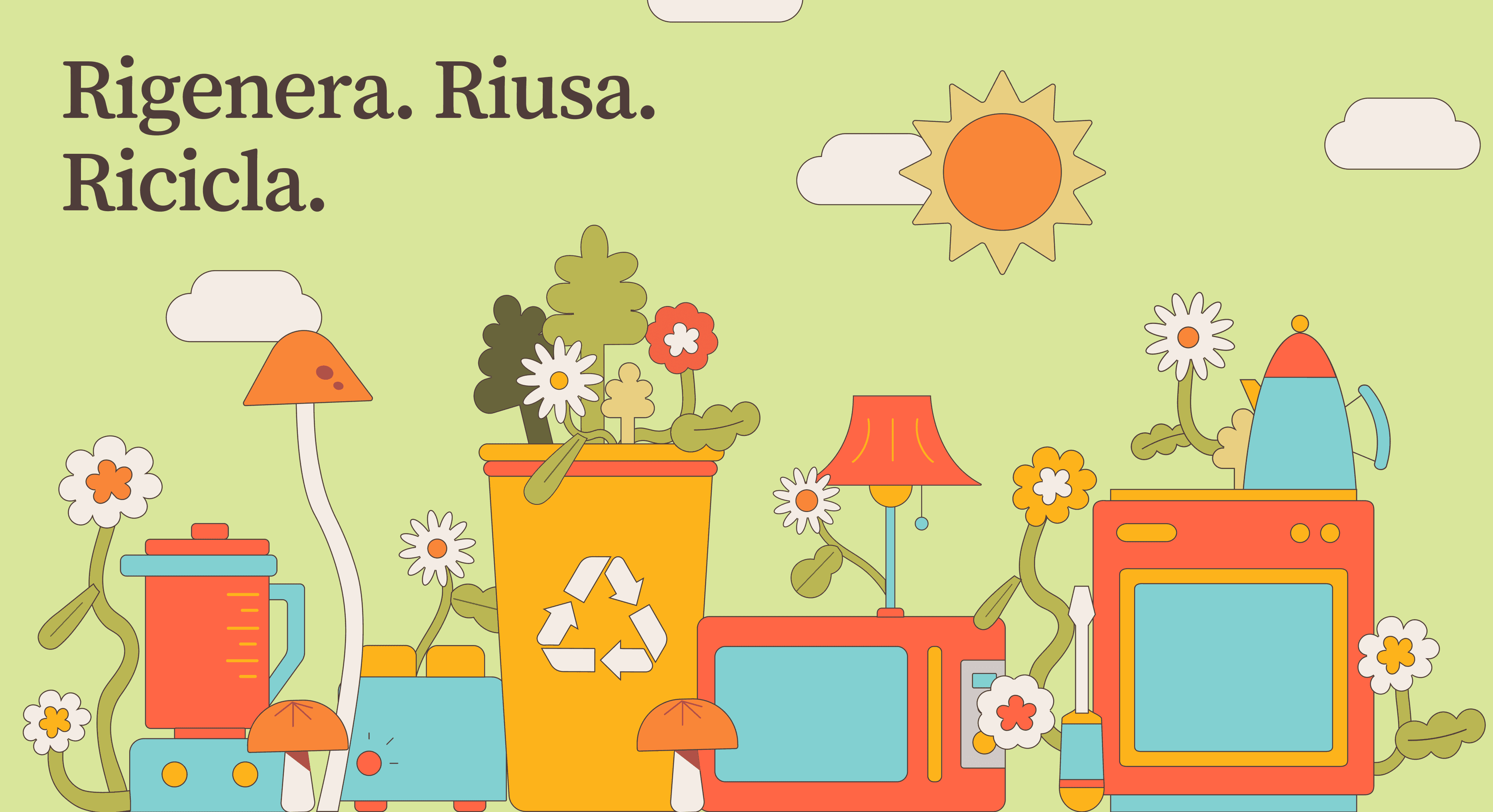
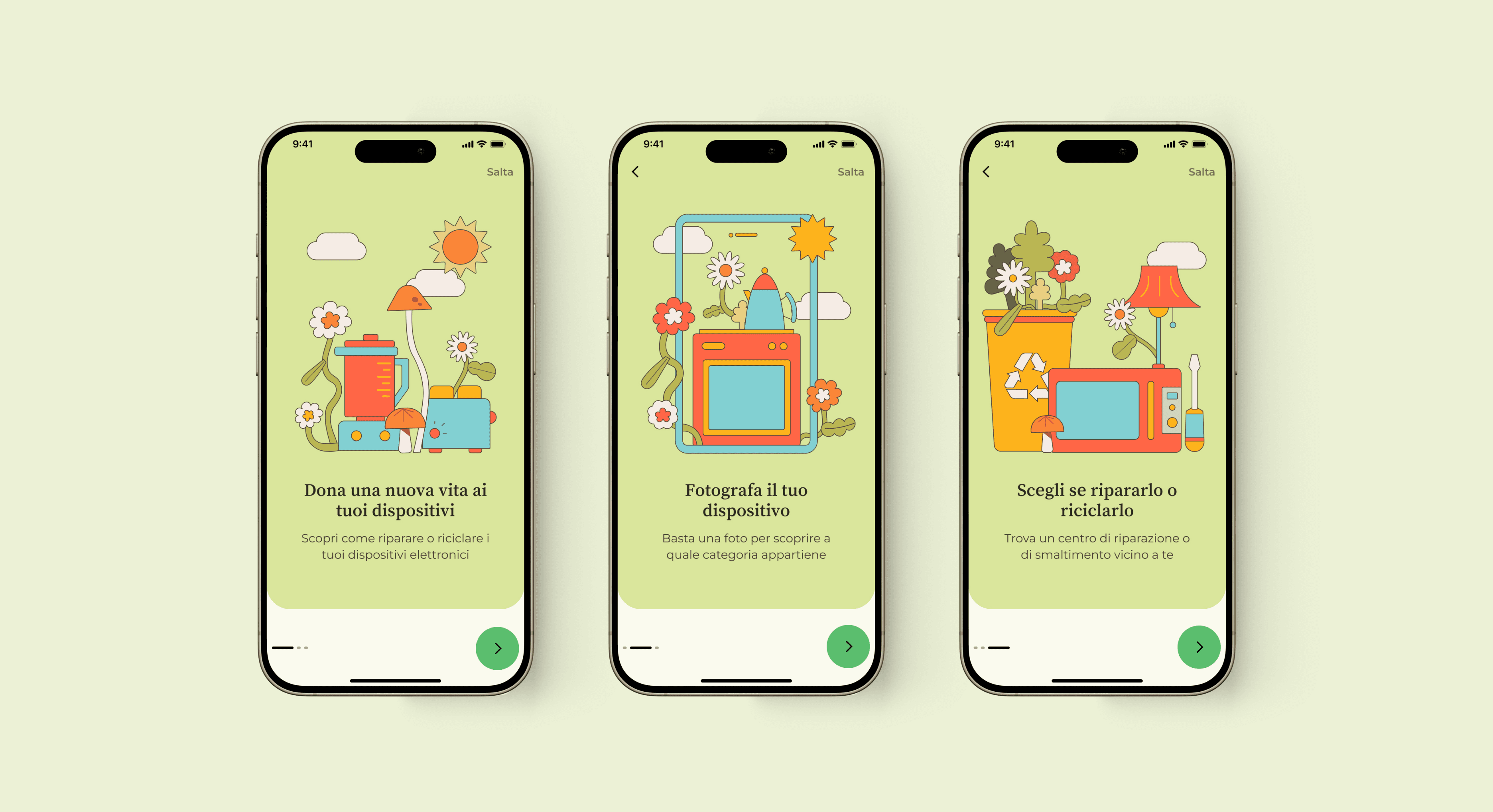
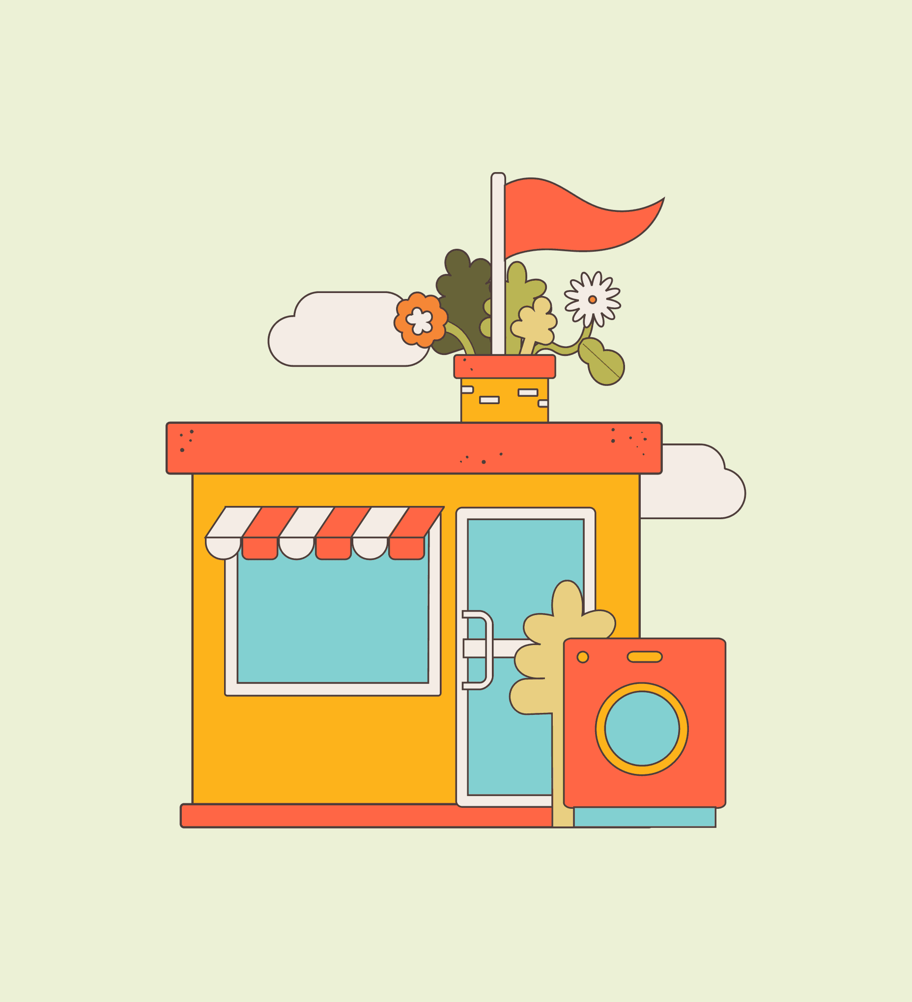
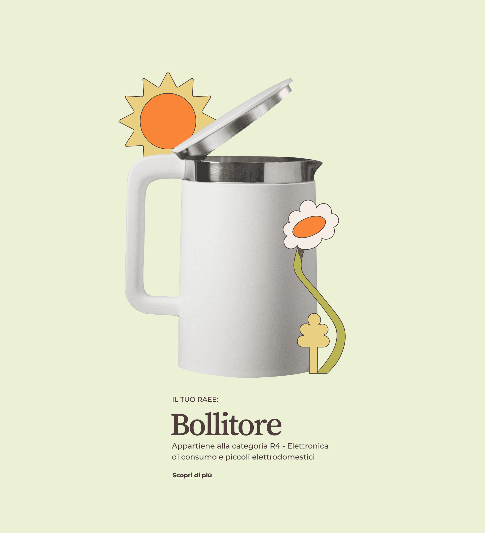
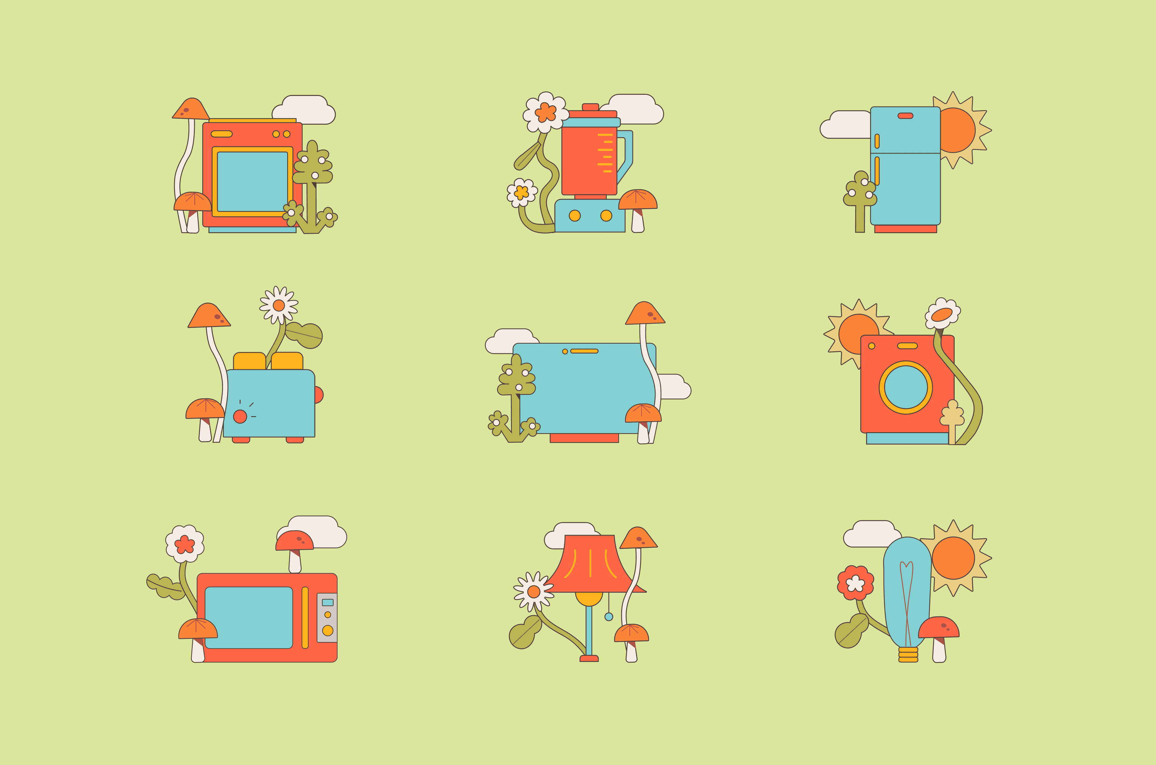
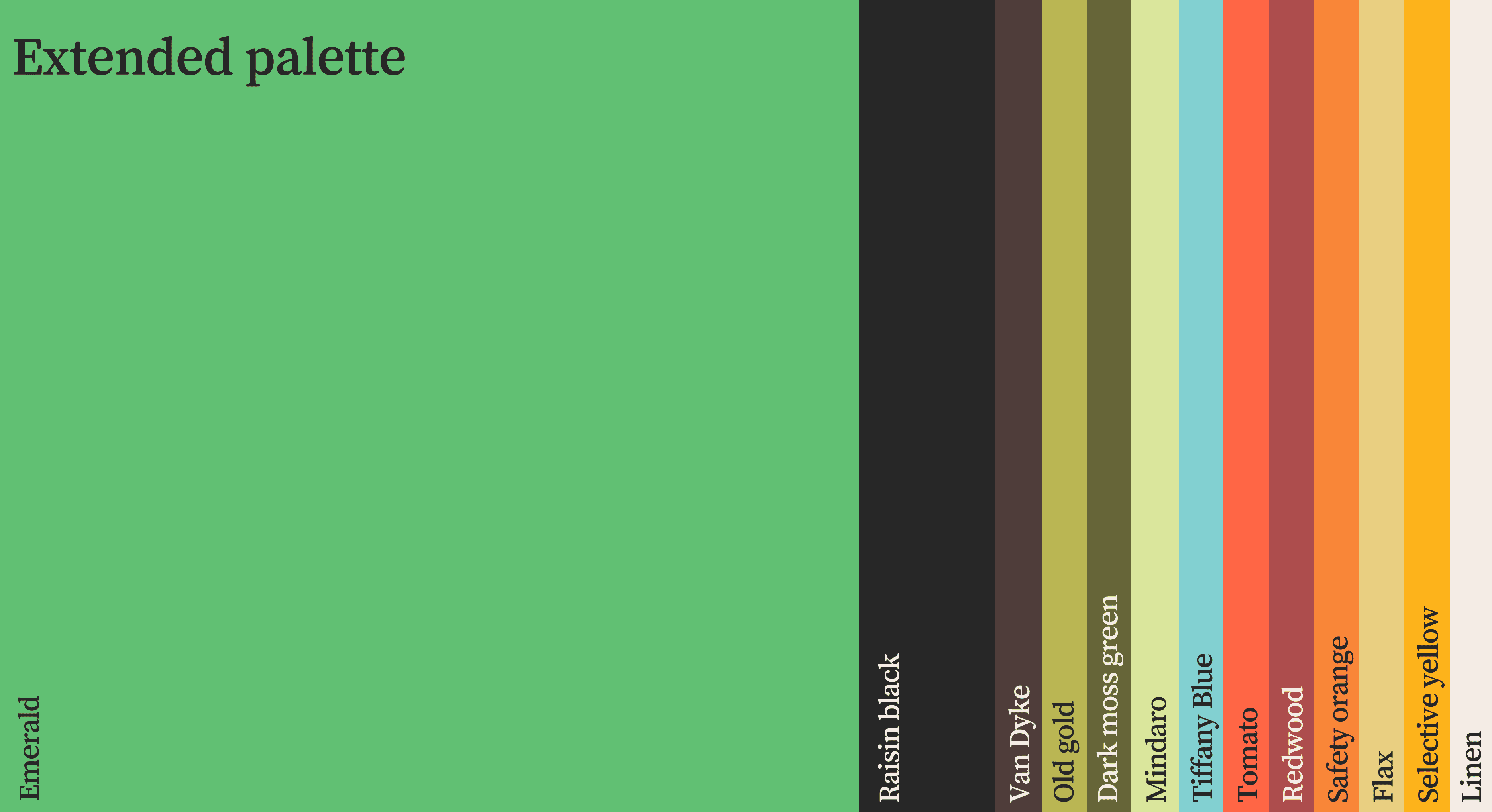
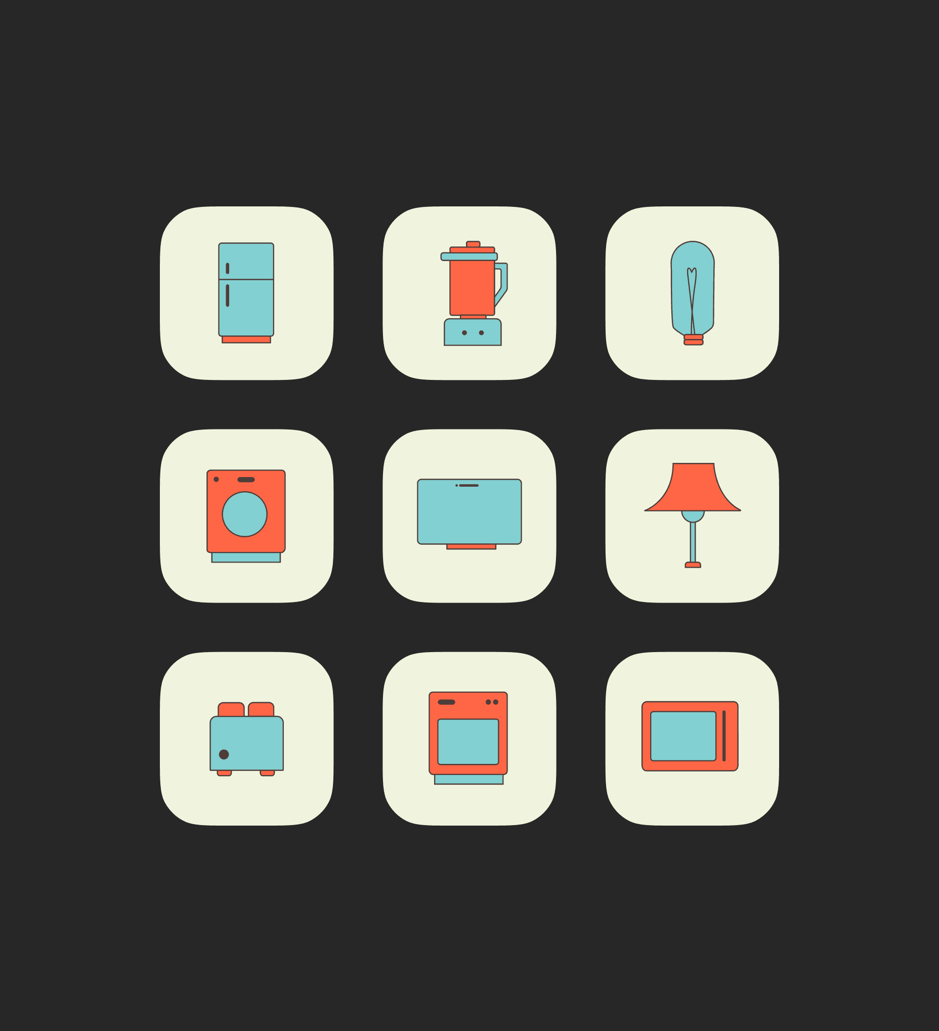
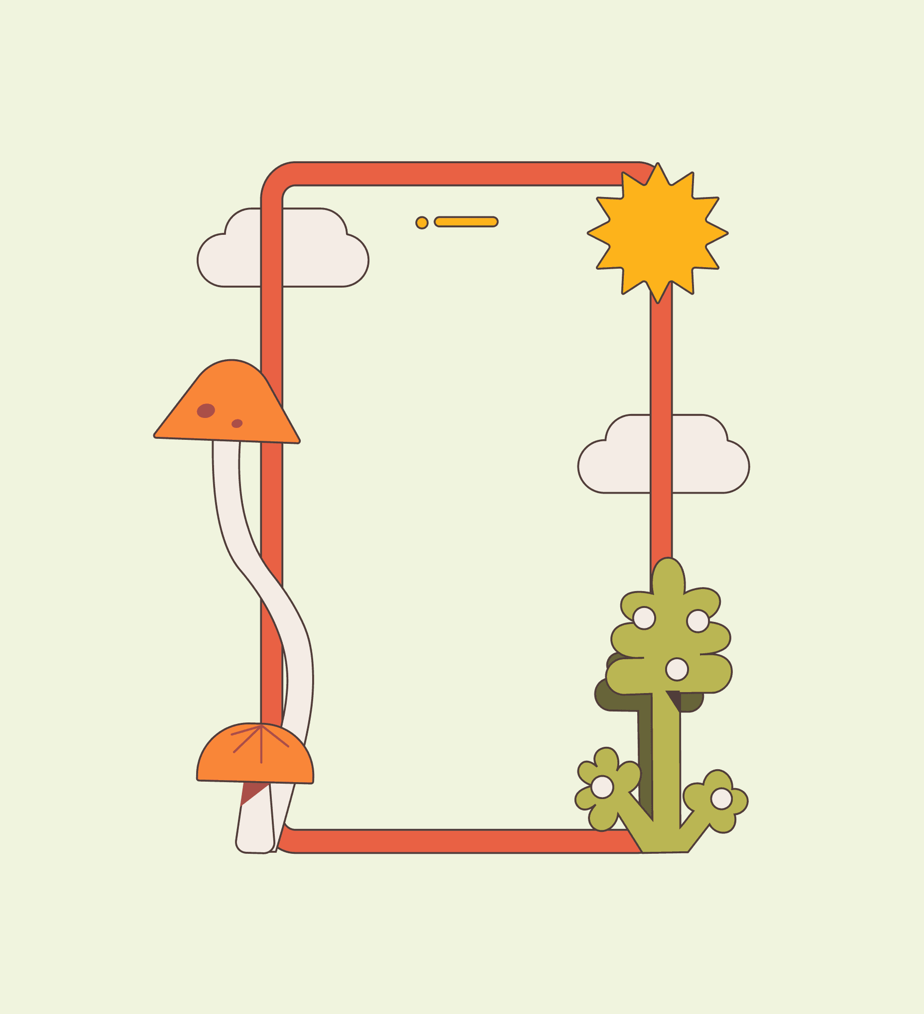
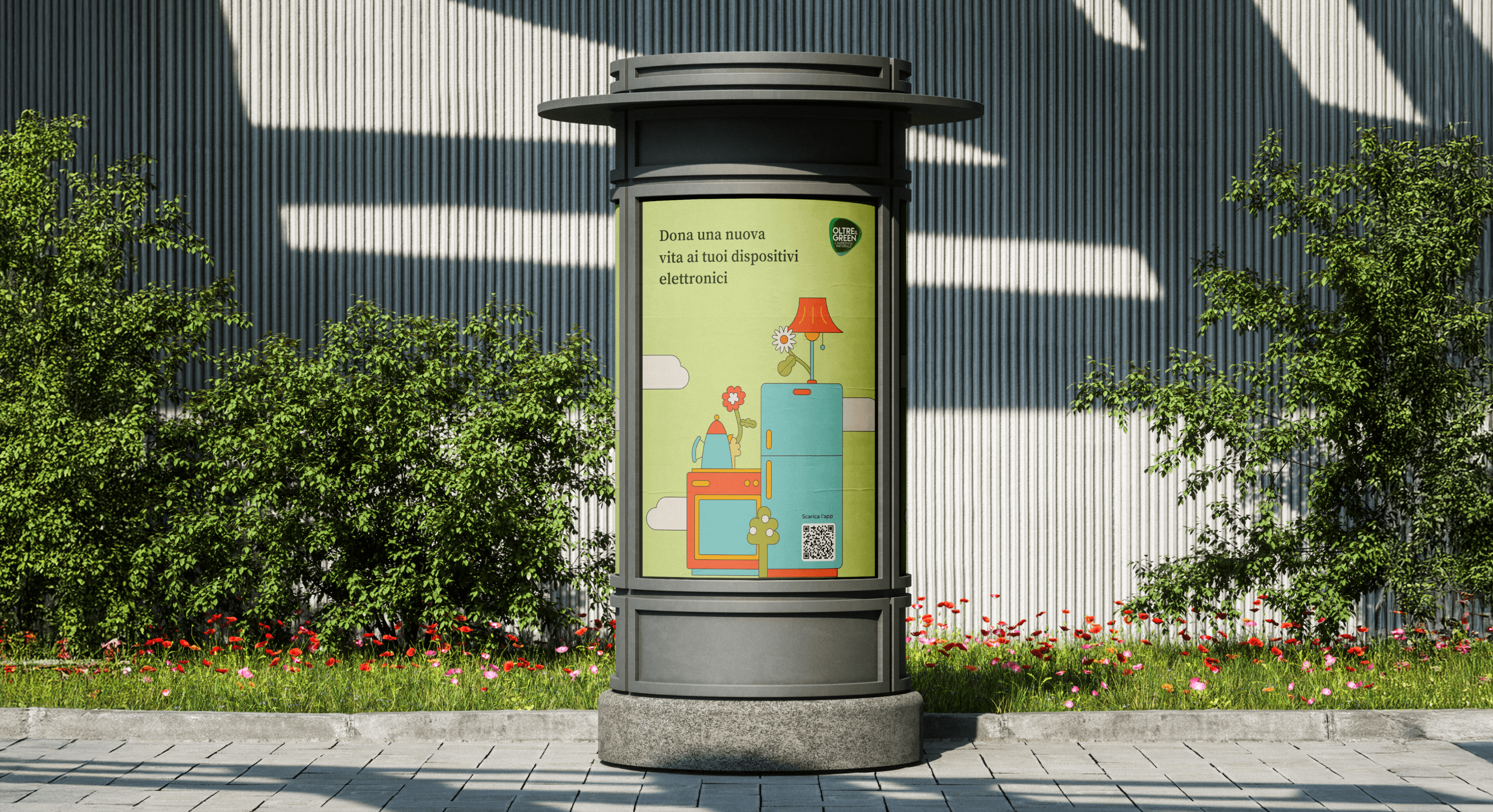
The illustration system is playful but not childish, so a seven-year-old and their parent both connect with it without either feeling talked down to. Electronic objects are drawn into natural settings, which keeps the sustainability message present without stating it outright. Live testing pointed toward making the app more rewarding to explore, so I built 50+ custom illustrations and icons that surface as you move through it, turning each screen into something new to discover. The visuals stop being decoration and become a reason to keep using the app.
DESIGN DECISION: VISUAL LANGUAGE
How do you make a technical topic appealing to a child and an adult at once?
The illustration system is playful but not childish, so a seven-year-old and their parent both connect with it without either feeling talked down to. Electronic objects are drawn into natural settings, which keeps the sustainability message present without stating it outright. Live testing pointed toward making the app more rewarding to explore, so I built 50+ custom illustrations and icons that surface as you move through it, turning each screen into something new to discover. The visuals stop being decoration and become a reason to keep using the app.
DESIGN DECISION: VISUAL LANGUAGE
How do you make a technical topic appealing to a child and an adult at once?
The illustration system is playful but not childish, so a seven-year-old and their parent both connect with it without either feeling talked down to. Electronic objects are drawn into natural settings, which keeps the sustainability message present without stating it outright. Live testing pointed toward making the app more rewarding to explore, so I built 50+ custom illustrations and icons that surface as you move through it, turning each screen into something new to discover. The visuals stop being decoration and become a reason to keep using the app.
LEARNINGS
Always trust blunt feedback
The most useful testers on this project were the children. Adults soften feedback to be polite, but children tell you immediately and without filter when something is confusing or boring, which makes the signal unusually clear. That honesty is what kept pushing the app toward usefulness over instruction: anything that felt like a lecture lost them instantly, so the design had to earn attention by being genuinely useful and engaging. I came away trusting blunt, unfiltered feedback more than the polite kind, because it shows you the real problem faster.
LEARNINGS
Always trust blunt feedback
The most useful testers on this project were the children. Adults soften feedback to be polite, but children tell you immediately and without filter when something is confusing or boring, which makes the signal unusually clear. That honesty is what kept pushing the app toward usefulness over instruction: anything that felt like a lecture lost them instantly, so the design had to earn attention by being genuinely useful and engaging. I came away trusting blunt, unfiltered feedback more than the polite kind, because it shows you the real problem faster.
LEARNINGS
Always trust blunt feedback
The most useful testers on this project were the children. Adults soften feedback to be polite, but children tell you immediately and without filter when something is confusing or boring, which makes the signal unusually clear. That honesty is what kept pushing the app toward usefulness over instruction: anything that felt like a lecture lost them instantly, so the design had to earn attention by being genuinely useful and engaging. I came away trusting blunt, unfiltered feedback more than the polite kind, because it shows you the real problem faster.
Next up